Time to make a book!
In this entry, I will cover: Color Study, transferring the drawing and illustrating a page.
Read about the process below
and go to YouTube to see it happen: https://www.youtube.com/watch?v=XEpa83Dcm-Q
Last week I talked about the planning and sketching of the book. This week I’ll talk about color study, transferring the image, and painting.
Color Study
To get into it! First thing first is a color study. The color study is not a finished page, the purpose of the color study is to test the colors before going into the final art. Basically it’s a rough draft. If I were doing this project for a client I would have done a few different color studies and options. But it’s just me and I think I know what I want so I did this test and now I am going to start working on the final pages.
The colors I will use will be mostly Burnt Sienna, Quinacridone Gold, Deep Viridian Green, Phthalo Blue, Yellow Ochre. Generally when coloring it is recommend to not use every color you have. Keeping the palette small makes for better cohesion.
Above: Color study. QOR Watercolor on Blick watercolor paper.
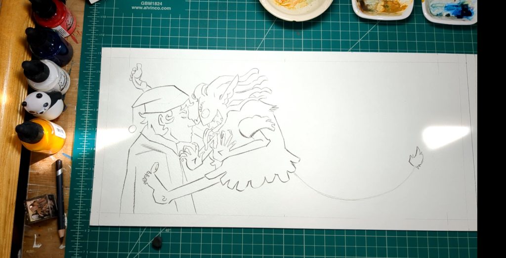
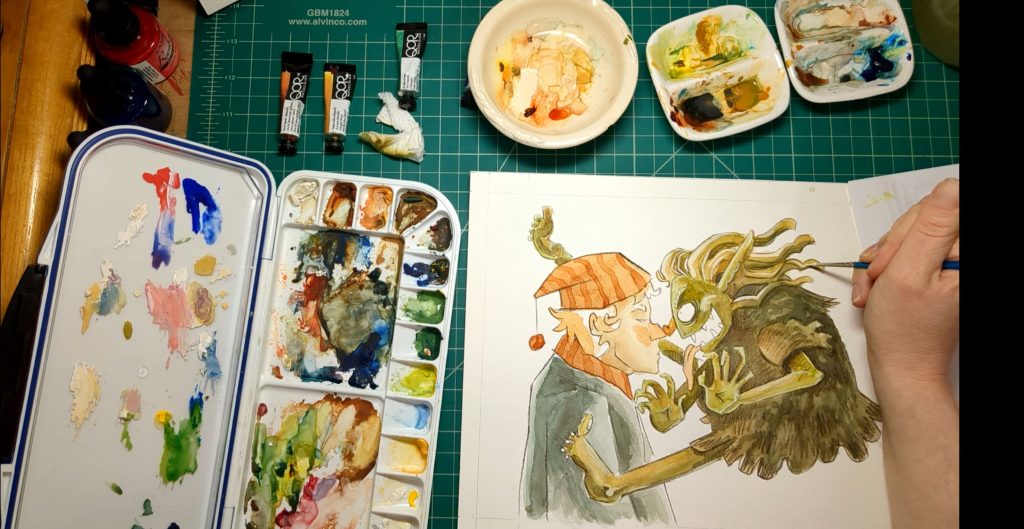
Transferring the drawing to the final paper
I scan my sketches into the computer, arrange, then print them out in the size I want to paint them.
Then I transfer the image onto the water color paper using a light box. (are they still called that even though they are not a box shape anymore?) Side Story: So this is weird. I never bought a light box because they were big and kind of expensive. I would use a window to trace images I need to transfer, of course the sun needed to be out, or put a lamp under a glass coffee table. And I never thought to look into new light boxes until my friend bought me this one last year for my birthday. And I am still so shocked that they are so small and cheap now. (*^*)
I lightly trace my sketch onto the paper. I use a pencil that is easy to erase. The lines I’m making now are guide lines and I will cover them up or erase them later.
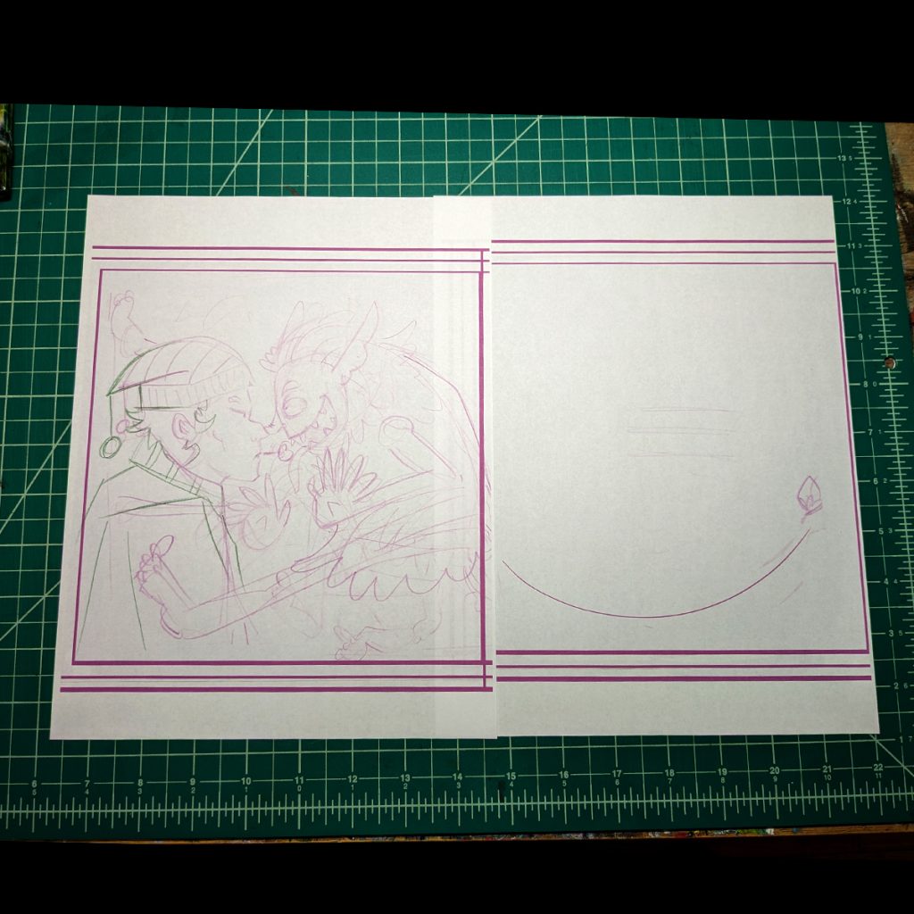
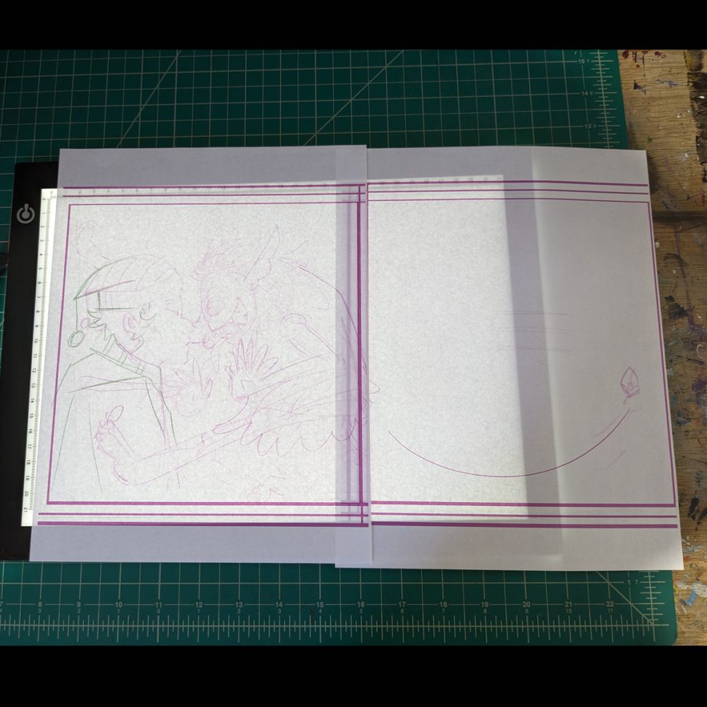
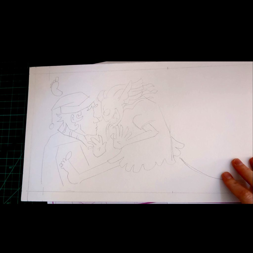
Above Left to right: Enlarged printed sketch. Printed sketch over light box. Final pencil guide lines
TIME TO ILLUSTRATE! (^o^)
I go over my guide lines with Derwent Procolor Burnt Umber 55. I’m trying the Procolor because the lead is harder then other color pencils. The packaging says its for “detail”. I’m using the pencil for lines and not for shading so a longer lasting point would be desirable. That’s my thinking.
I did run into a little problem. Because the paper I have is cold press it has a big texture on the surface. This is pushing my pencil around a little bit. It’s nothing I can’t work with or deal with but I think I want to try some hot press next time. For now it’s ok but if I wanted more control or detail in my line it would be hard to manage.
Once the lines are drawn I carefully erase the pencil sketch. I use a kneaded erasure because this lifts off the lead without rubbing off the paper. I don’t want to rub to much anyways because it would probably smear my color pencil lines.
Above: The color pencil drawing done over the guide lines.
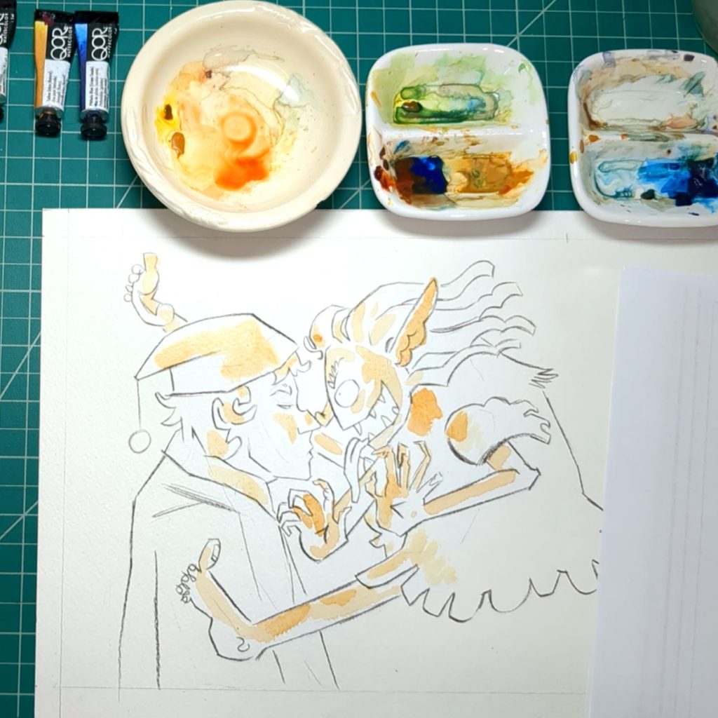
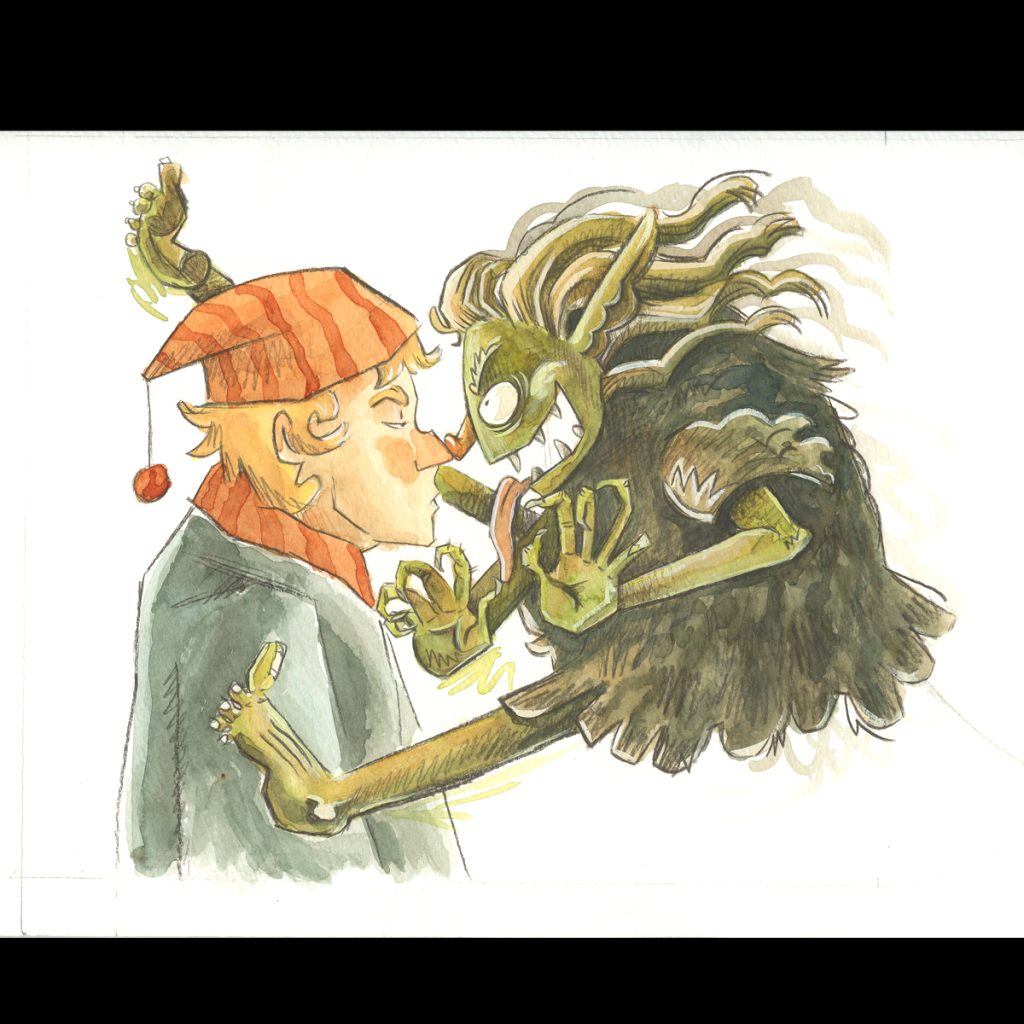
Water color is still kind of new to me. I don’t think I did things in quite the right order. I used orange where I wanted the light source to be touching. I wanted those ares to be warm in color.
Then I designated where I wanted the darkest shadow to be. While I’m doing this I am remembering that to make things visible, the dark shapes and the light shapes need to work with each other. For example, I want the hand to be visible and pop from the troll, so I keep in mind that the hand will be lighter and the shapes behind it will be darker. To put it simply. Or maybe if I say, I’m not thinking in regards to color but in regards to shadow and light, or tone and value. Does that make sense?
When this painting is done I should be able to make a gray value image of it and the shapes should still read just as well as if they were colored. I’ll show that at the end of the video and we will see together if I did it right.
Then I slowly build up the layers and colors. I am trying to experiment with looseness and texture.
I found that I painted too dark. I should have maybe left some white in some places.
To fix this I used a damp paint brush to activate the paint on the paper and I used a paper towel to dab the wet paint off.
Then, I thought this would be a very bad idea, but I tried it anyway: I made my highlights with gouache with a little bit of the watercolor mixed in. It went ok, scary but ok, maybe not great but maybe fine?? It’s ok. I think next time I will try very hard not to color the whole figure and leave some space white. I think this would help with the energy of the illustration.
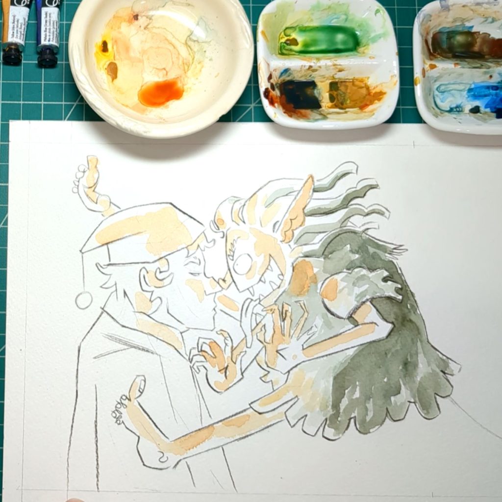
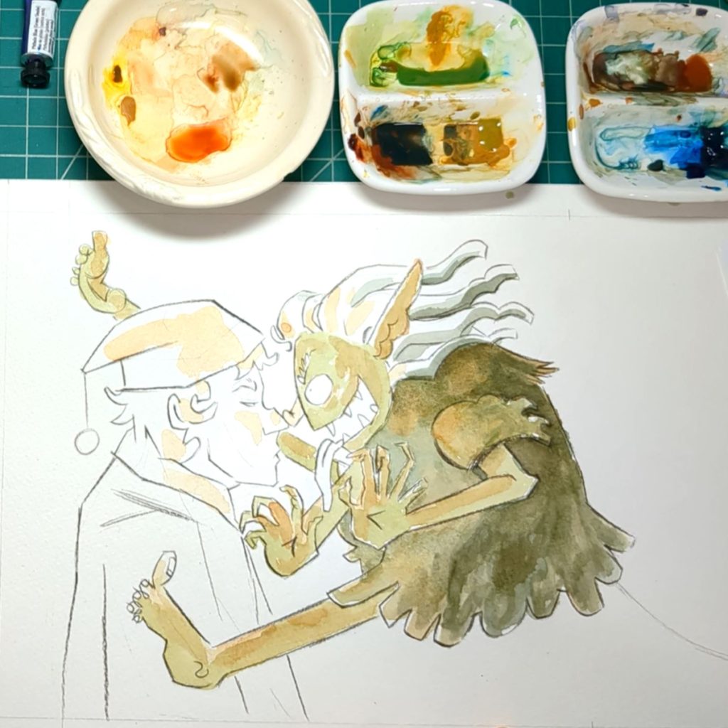
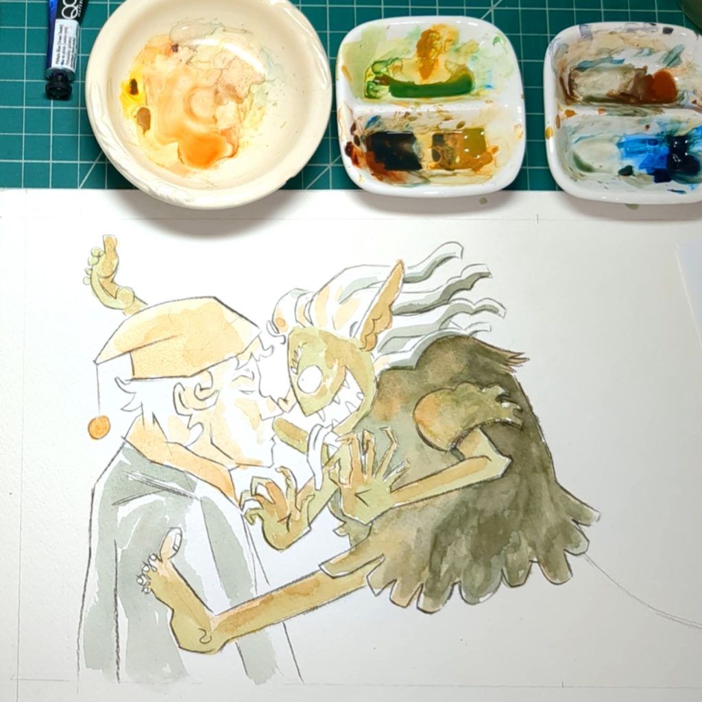
Above: The process and slow built up of watercolor
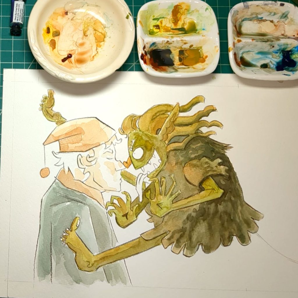
The guy was pretty straight forward. I like the stripes in the hat and scarf. I think the natural texture of the watercolor works very well there
It was looking too clean so I scribbled some watercolor outside of the lines of the creature. And I like this a lot; I think it adds motion and energy to it.
It’s hard for me to break out of my habit or being neat and clean, but I’ll get there. (>_<)
After the painting was done I went over to add embellishment with the procolor pencil.
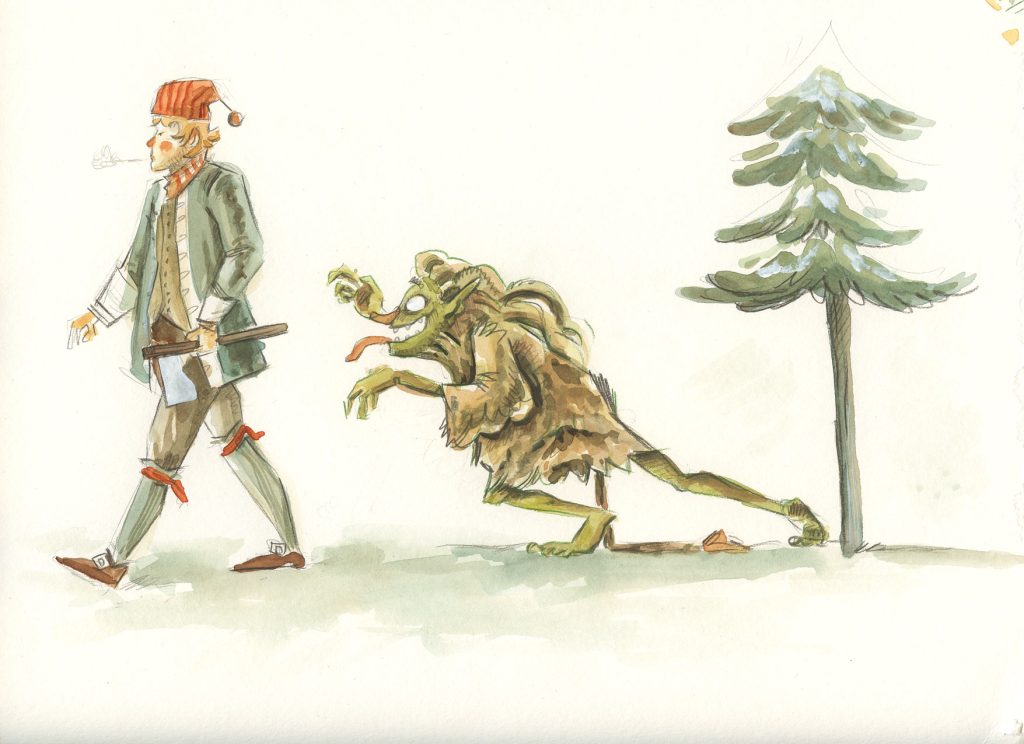
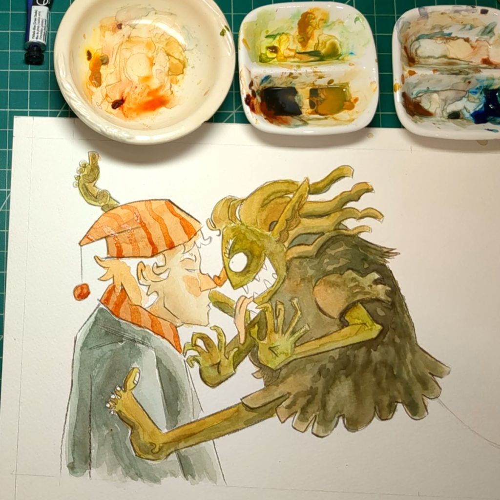
Final painting below.
Conclusion
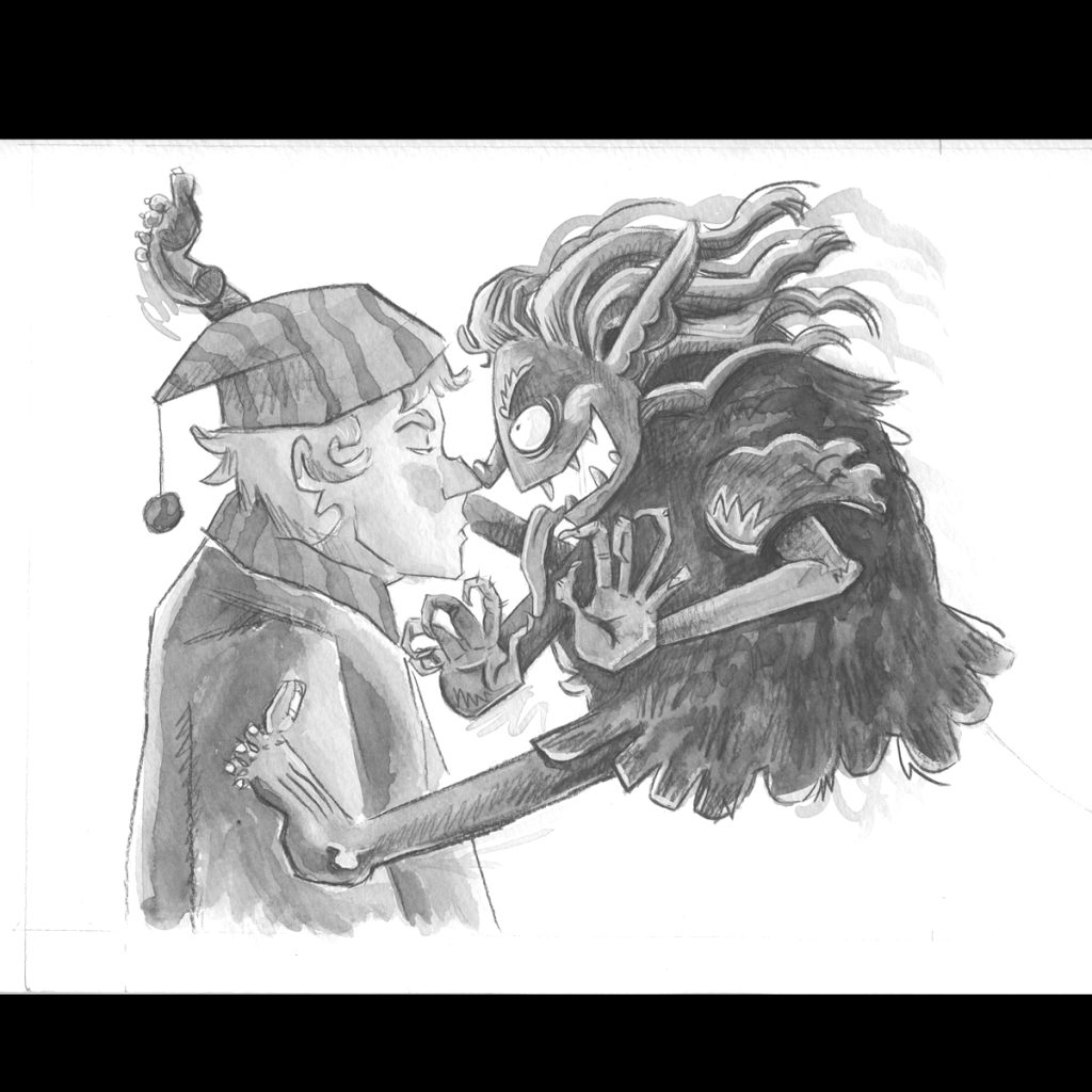
Above: The finished painting and the same image in gray scale to show values.
So there is one page painted.
The painting has some texture but it is a little cleaner then my intention. I really like scribbling with the pencil to make shadows.
I can see in the grey image the value it pretty good. Though the value between the trolls foot and the man’s shirt is close I don’t think I will change this since the focus is about the faces.
If you look at the troll arm against it’s body you can see it reads very clear. And that’s what I keep in mind as I color and shade.
Overall it looks okay. I will put it aside and start the next page and look at this again later with fresh eyes.
Next Time!
There are something like 18 pages to paint. So the next video will be more painting! I’ll make every video unique and interesting to the process so things do not become repetitive and you are not just watching me paint for hours and hours.
I am making notes of topics to make videos about. If there are any particular questions you have please feel free to comment below. So far I have been sharing the things I notice. And maybe I am overlooking things that are interesting to you. Or maybe I need to go into more detail about a topic. Let me know!