Spring is here and the tulips are growing! I am trying to finish the troll picture book but other needs keep coming up. It was a good project to work on when the days were cold and dark but I’m starting now to get the itch to move onto a new project something with more color and adventure. Working this time of year is hard in general. It’s hard to be at the desk on the start of the warm sunny days.
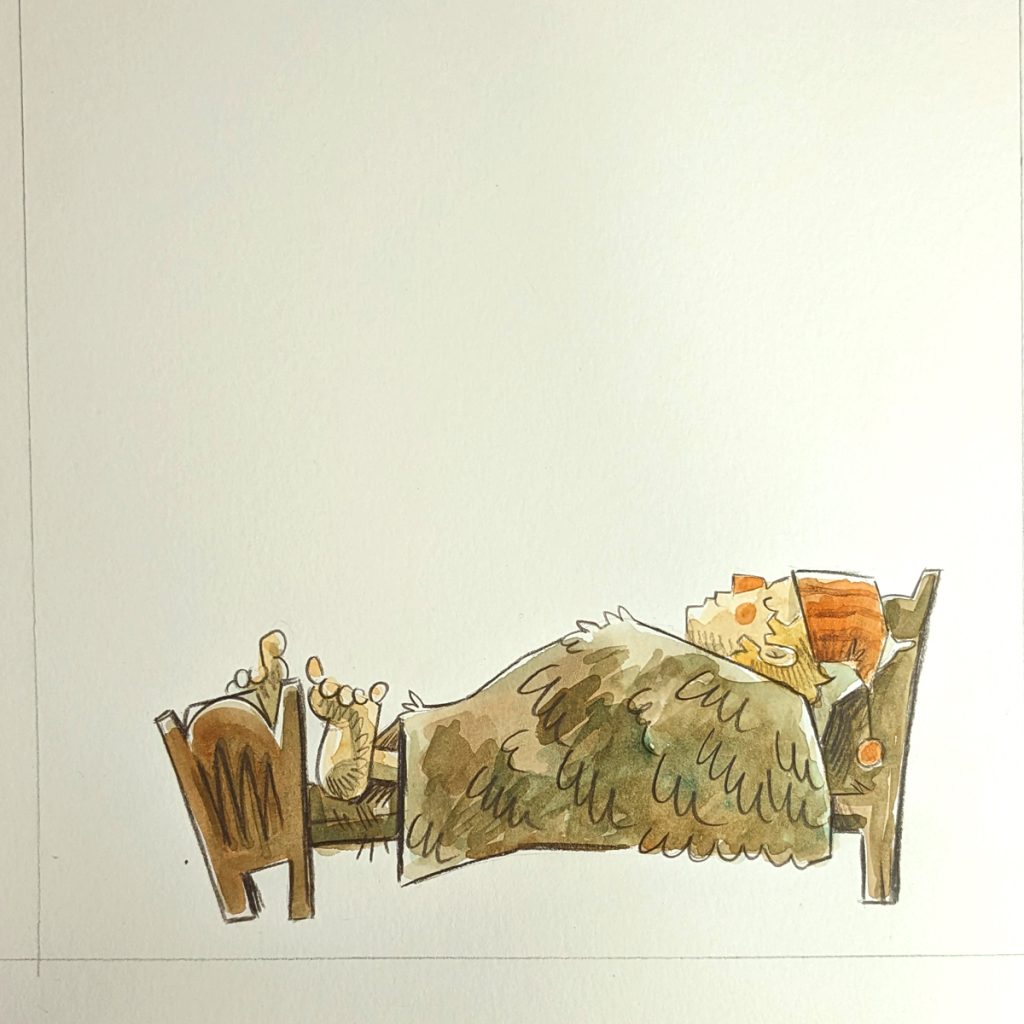
I will finish the troll book and it is coming along but I haven’t had much brain space to make a video for it yet. Instead here is a quick little inking video to buy me some time.
Tools: Strathmore Bristol paper smooth surface – good for ink Paper Mate Sharpwriter – Any pencil is good, this one erases easily and has a soft led Kuretake Pen – for main outline Pentel GFKP brush pen – for filling in big areas Micron 03 – for details and texture kneaded eraser – for erasing
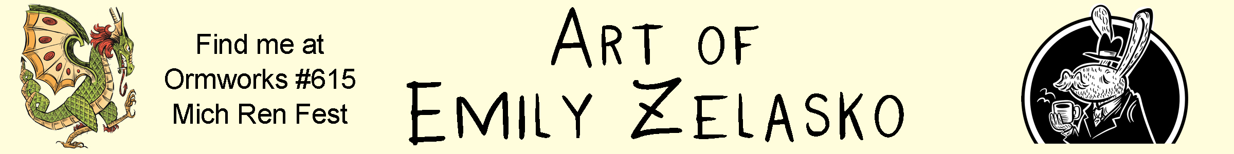
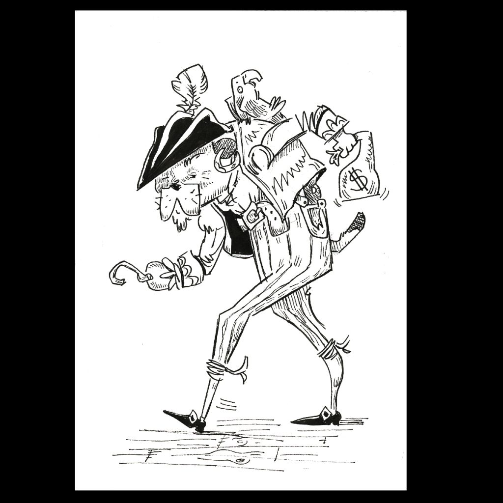
I start with a very basic shape or gesture. This allows me to quickly determine where my pirate is going to go on the page.
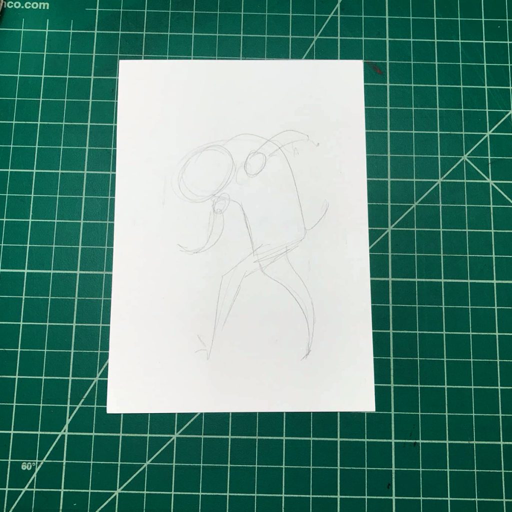
Next I draw in all the details making it up as I go! I would normally draw light but I wanted the camera to pick up my drawing.
I’m not sure where my love for pirates came from but it’s one of the few consistent things in my life. I have always liked pirates. I had a pirate themed wedding.
If you have been following along with the other videos you may be getting the hint that I am trying to loosen up with my drawing. I like to play around with unreal shapes and lines.
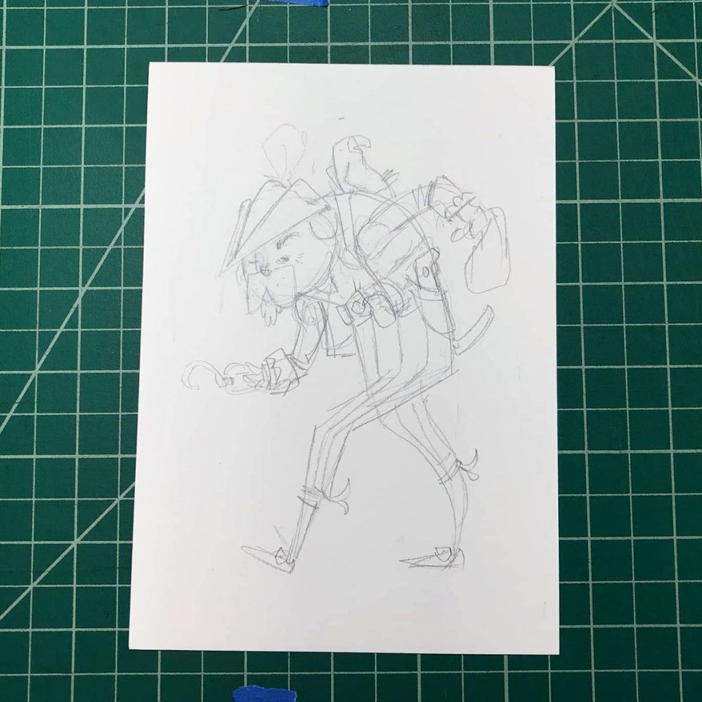
When the drawing is done I do the main lines with the Kuretake pen. I fill in the bigger parts with my Pentel GFKP brush pen. Then I do the texture and details with the Micron 03 pen.
There are many many different ways to ink. I did it this way because I like the definite difference between the Kuretake and Mircon. And thats my pirate dog!
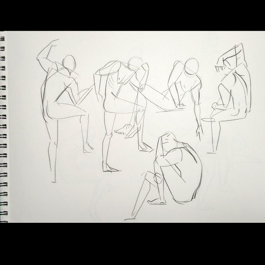
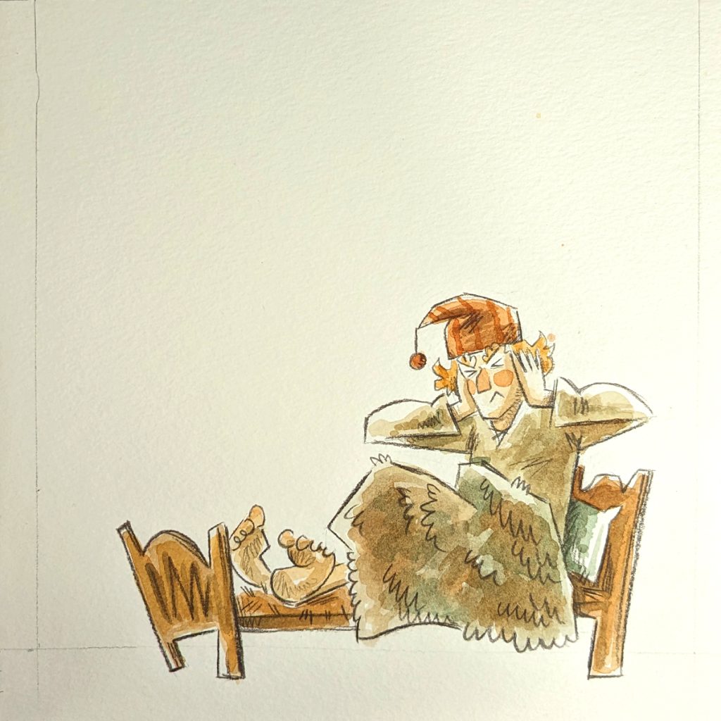
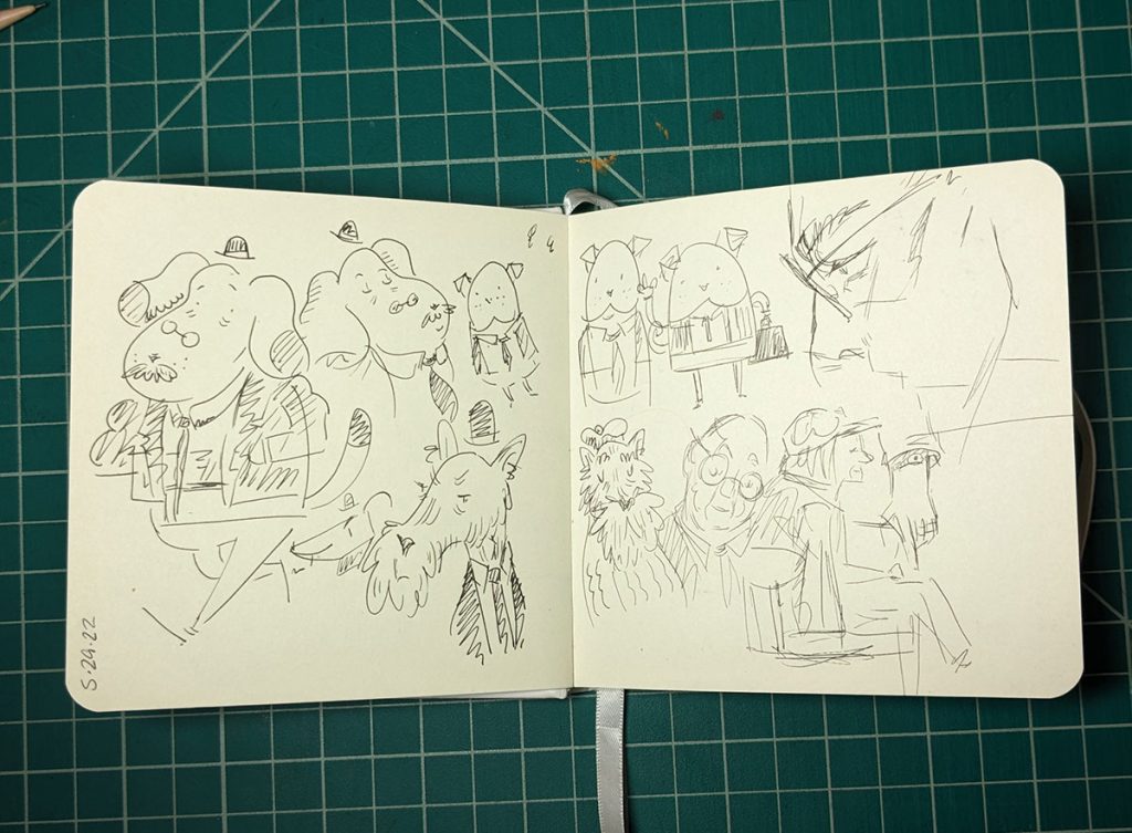
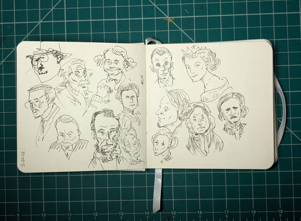
Another project came up so the book is on hold for a sec. Because of that I decided to do a little informal life drawing video. I should do life drawing more often. It’s very good exercise.
The first group of drawings were done with a one minute timer. These drawings are referred to as gestures. They are meant to loosen up and also to get a feel for the movement and the weight of the figure.
Gestures are usually done with wispy fast lines, but I just prefer drawing with hard shapes more. Sometime I really enjoy the simplicity of this method.
Above: One minute poses
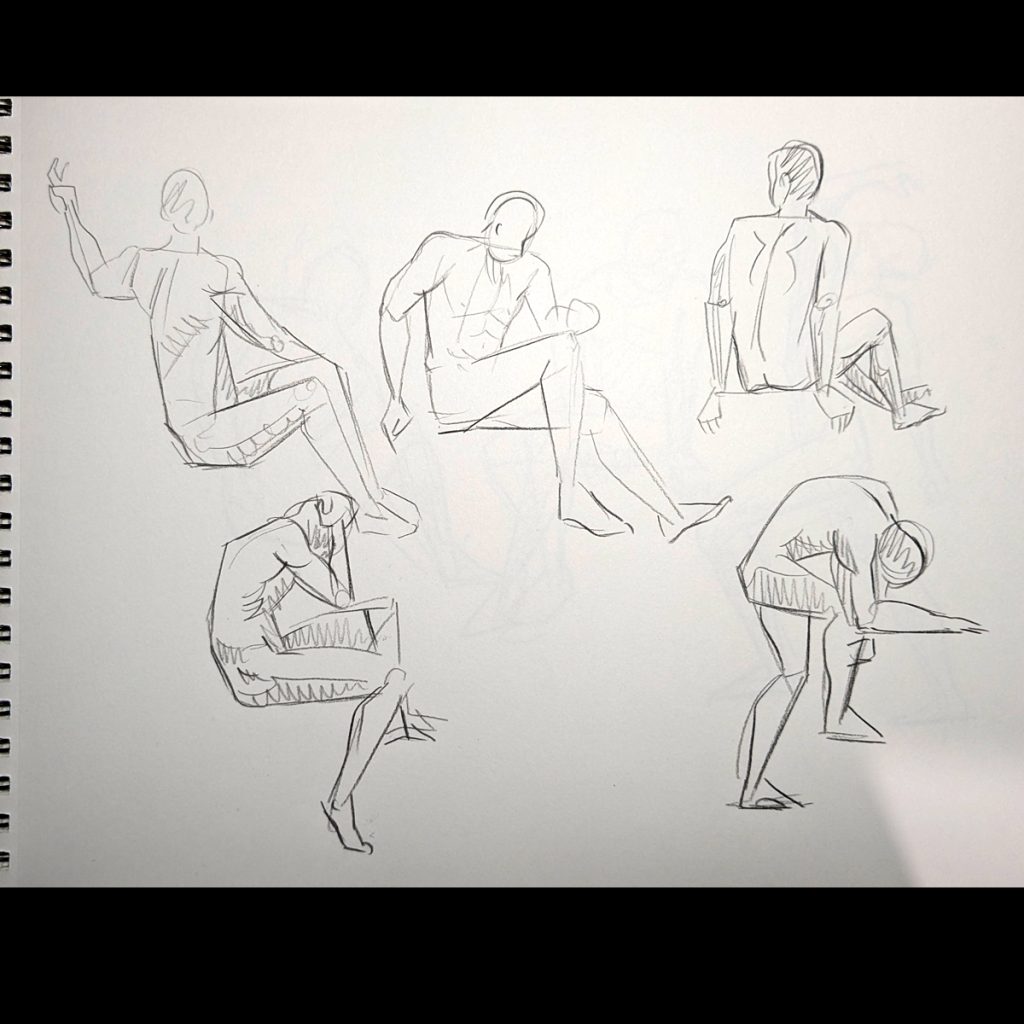
Next is the two minute poses. An extra minute gives one more time to put in more information. You can see I scribble in some shadow here. I feel a little shadow can add a lot to a scribble.
Above: Two minute poses
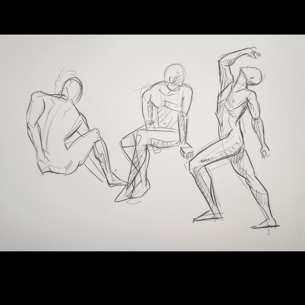
This last page was meant to be a five minute drawing but I did not like the poses. Instead I drew them real quick. Then I went back to a more interesting pose and took a few minutes experimenting with the line and the shape.
Above: Took what ever time I wanted to figure out the mussels and movement on the figure on the right. 3-5 minute.
In all it took about 25 minutes to do these drawings.
When I do these and I’m just here to draw. I’m putting out of my mind trying to make the best drawing I can (which is hard to do when I know I am going to share it). It’s just some fun practice and a good way to clear my head and slow down.
For anyone who would like to draw you can visit New Masters Academy on youtube. Have fun drawing!
Last week we started the paint process. Since then I have done and handful of illustrations. Here are my thoughts.
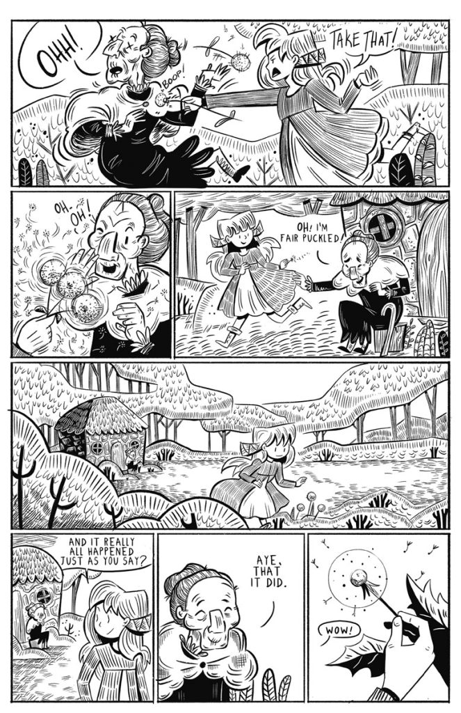
I heard that its good to have a hook at the beginning of a blog. Therefore, I have looked up the world’s best knock knock joke.
Knock, knock. Who’s there? Little old lady. Little old lady who?
Read to the end for the punchline.
I have been jumping around between different water color paper and mix media paper. One of the first paintings I did was the dark interior shot below. This was on mixed media paper. I was very impressed with how it came out. I have not painted like this in a while (or maybe ever with water color) and I was very pleased to see I had this in me. XD There were no problem with it and perhaps the whole book could be done in this manner. This second painting was done on the same paper. It came out fine, all good. But this third painting was done on Stonehenge watercolor paper. And the colors do seem a touch more bold.
Above from Left to Right: QOR watercolor paint on strathmore mixed media paper, QOR watercolor paint on strathmore mixed media paper, QOR watercolor paint on Stonehenge watercolor paper.
I was not sure so I went back and forth between mix media and water color paper. I was using the mixed media paper for the sake of the pencil, but watercolor paper takes the watercolor better, as you may expect. The colors are also a little stronger and the darks seem to get a little darker and it handles the moisture better. Who knew?
The three images below were painted at the same time but on different paper. Stonehenge watercolor, Blick watercolor, and Strathmore watercolor paper. They all came out well enough, but my gut says I like Strathmore more. Because of the texture on the paper, the pencil lines come out a little gritty, but maybe I like that texture right now. In the previous video I expressed a concern that the texture on the Strathmore paper was pushing the pencil around too much. But it seems I can still get the lines I want and the colors of the paint and the pencil come out well.
Above: Stonehenge watercolor, Blick watercolor and Strathmore watercolor paper
Above: Pencil lines shown on Stonehenge watercolor, Blick watercolor and Strathmore watercolor paper
My favorite pages so far are these done on Strathmore watercolor paper.
To get the desired darks gouache is being used. I can’t seem to get too dark with just water color. Which is fair enough. Watercolor is more translucent and gouache is known for being opaque. For this big face I did a base of water color, then for the shadow and darks I uses gouache.
One last note: I paint and paint and paint. And it never feels right. Until I put the pencil over it, then it all comes together. My thought is that I wonder if I’m over-doing the coloring. It could be that the color can be quite simple and the pencil is what brings everything to life. So I may try less paint on the next pages.
Sometimes it feels like I’m wasting my time. Like, after one test, should I not know what I like and don’t like? But as I was painting the other day I was thinking about how this is all good experience. And trying the same technique multiple times and still not knowing how I feel about it is fine. Because hopefully each time I paint I’m learning a little more about the material. Then after gathering many hours of trial I can make a more specific judgment of the material and what I should change next. I need to understand, too, if I am the problem or is the material the problem lol.
Above: Other samples of the painting done so far
Keeping all that in mind I have a new plan for the next set of a paintings.
I am going to switch primarily to gouache instead of watercolor. The hope is I can get to my desired colors more quickly and it might be I don’t need as much painting as I thought I needed. I’ll add the pencil lines sooner in the process to see how that goes.
The next paintings will be done on watercolor paper because this seems better for the pop of color and they handle the wet better.
Unfortunate news: The pencil that was being used for these illustrations is quickly becoming smaller and smaller. We hope that it will last this project but if not there may be a search for a stand in.
These findings are probably not surprising. Watercolor paper works better for watercolor. Wow. But I had to learn it for myself. And you never know until you know. The mixed media paper could have been better, I could not say until I tried it. A reminder, these logs are not tutorials, they are following along the journey. So if I ever am making obvious mistakes, those are just part of the journey XD
Next time we will see how the gouache works out.
Oh yes the knock knock joke…
Knock, knock. Who’s there? Little old lady. Little old lady who? I didn’t know you could Yodel!
I am sorry to report there is no world’s best knock knock joke because they are all bad. This was the most tolerable.
Okay, see you next time; where the next hook will be yo mama jokes.
Last week I talked about the planning and sketching of the book. This week I’ll talk about color study, transferring the image, and painting.
Color Study
To get into it! First thing first is a color study. The color study is not a finished page, the purpose of the color study is to test the colors before going into the final art. Basically it’s a rough draft. If I were doing this project for a client I would have done a few different color studies and options. But it’s just me and I think I know what I want so I did this test and now I am going to start working on the final pages.
The colors I will use will be mostly Burnt Sienna, Quinacridone Gold, Deep Viridian Green, Phthalo Blue, Yellow Ochre. Generally when coloring it is recommend to not use every color you have. Keeping the palette small makes for better cohesion.
Above: Color study. QOR Watercolor on Blick watercolor paper.
Transferring the drawing to the final paper
I scan my sketches into the computer, arrange, then print them out in the size I want to paint them.
Then I transfer the image onto the water color paper using a light box. (are they still called that even though they are not a box shape anymore?) Side Story: So this is weird. I never bought a light box because they were big and kind of expensive. I would use a window to trace images I need to transfer, of course the sun needed to be out, or put a lamp under a glass coffee table. And I never thought to look into new light boxes until my friend bought me this one last year for my birthday. And I am still so shocked that they are so small and cheap now. (*^*)
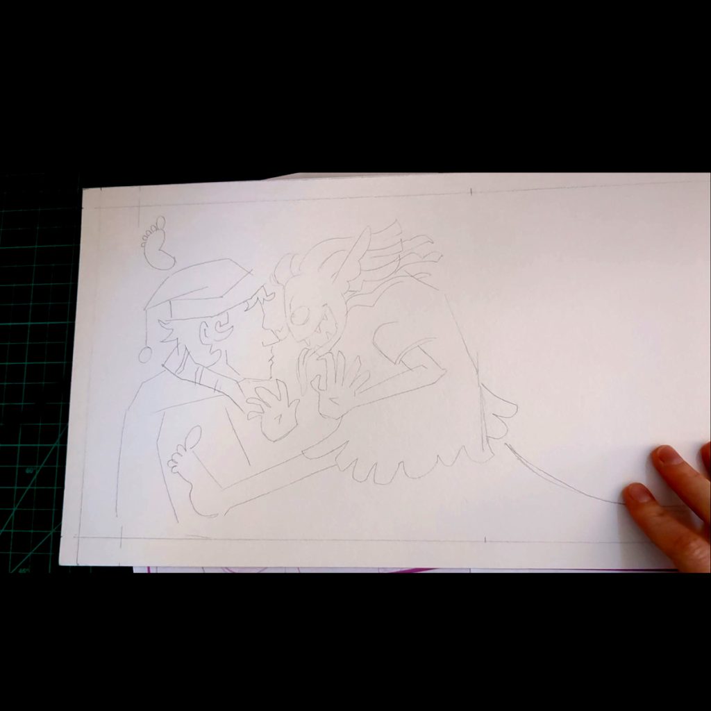
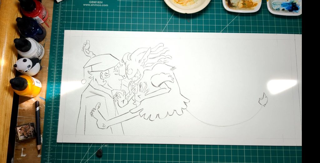
I lightly trace my sketch onto the paper. I use a pencil that is easy to erase. The lines I’m making now are guide lines and I will cover them up or erase them later.
Above Left to right: Enlarged printed sketch. Printed sketch over light box. Final pencil guide lines
TIME TO ILLUSTRATE! (^o^)
I go over my guide lines with Derwent Procolor Burnt Umber 55. I’m trying the Procolor because the lead is harder then other color pencils. The packaging says its for “detail”. I’m using the pencil for lines and not for shading so a longer lasting point would be desirable. That’s my thinking.
I did run into a little problem. Because the paper I have is cold press it has a big texture on the surface. This is pushing my pencil around a little bit. It’s nothing I can’t work with or deal with but I think I want to try some hot press next time. For now it’s ok but if I wanted more control or detail in my line it would be hard to manage.
Once the lines are drawn I carefully erase the pencil sketch. I use a kneaded erasure because this lifts off the lead without rubbing off the paper. I don’t want to rub to much anyways because it would probably smear my color pencil lines.
Above: The color pencil drawing done over the guide lines.
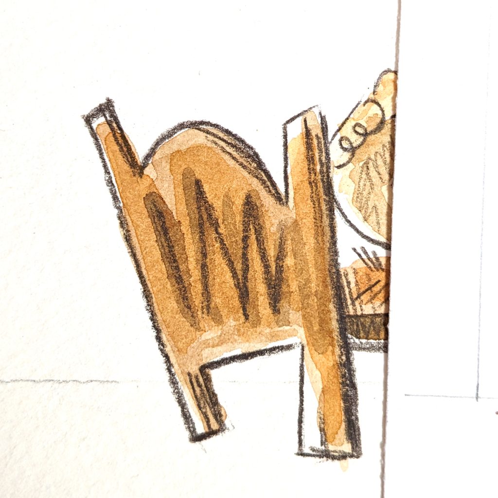
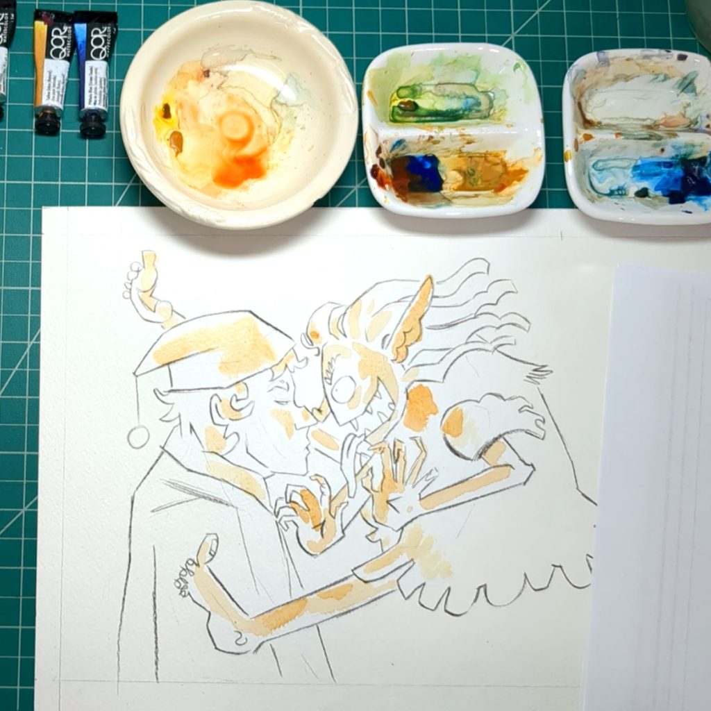
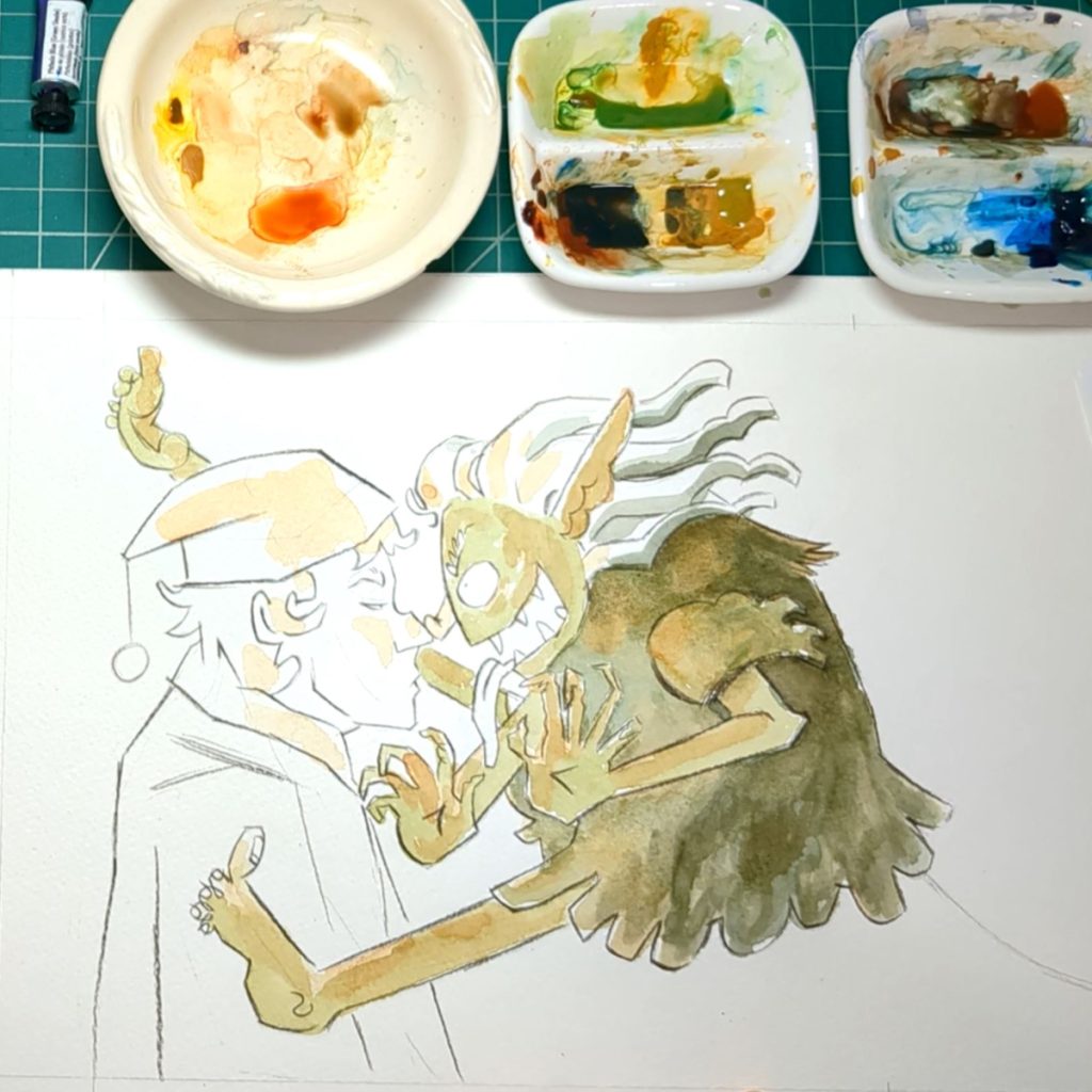
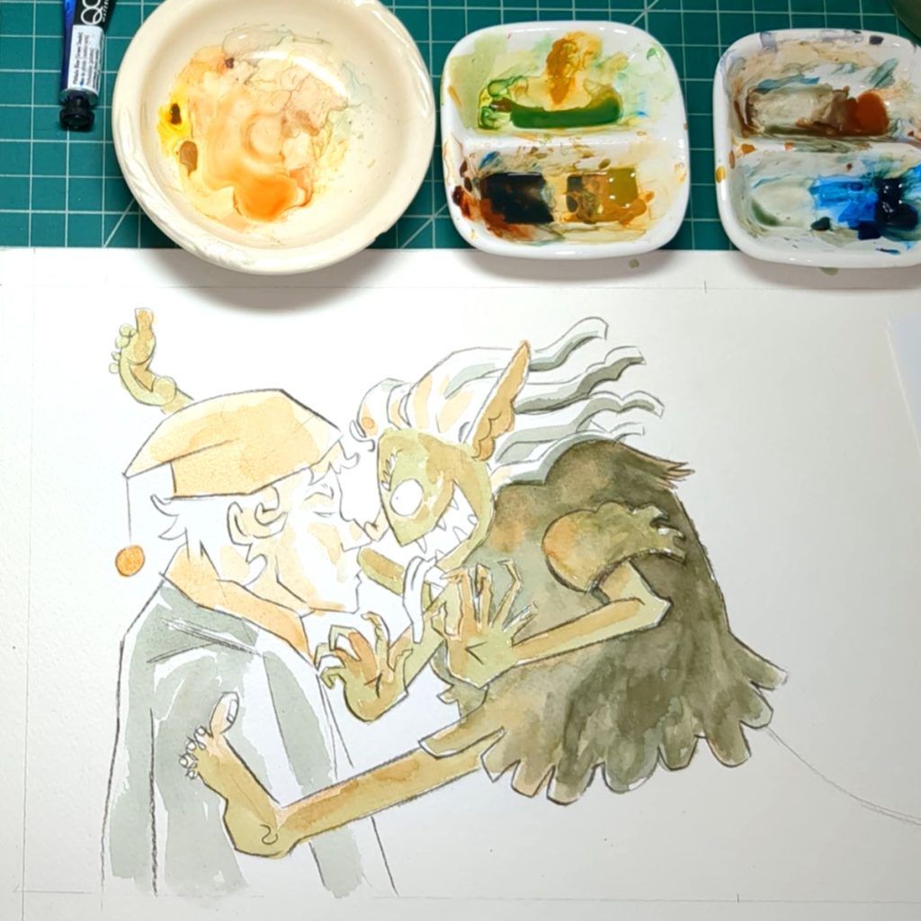
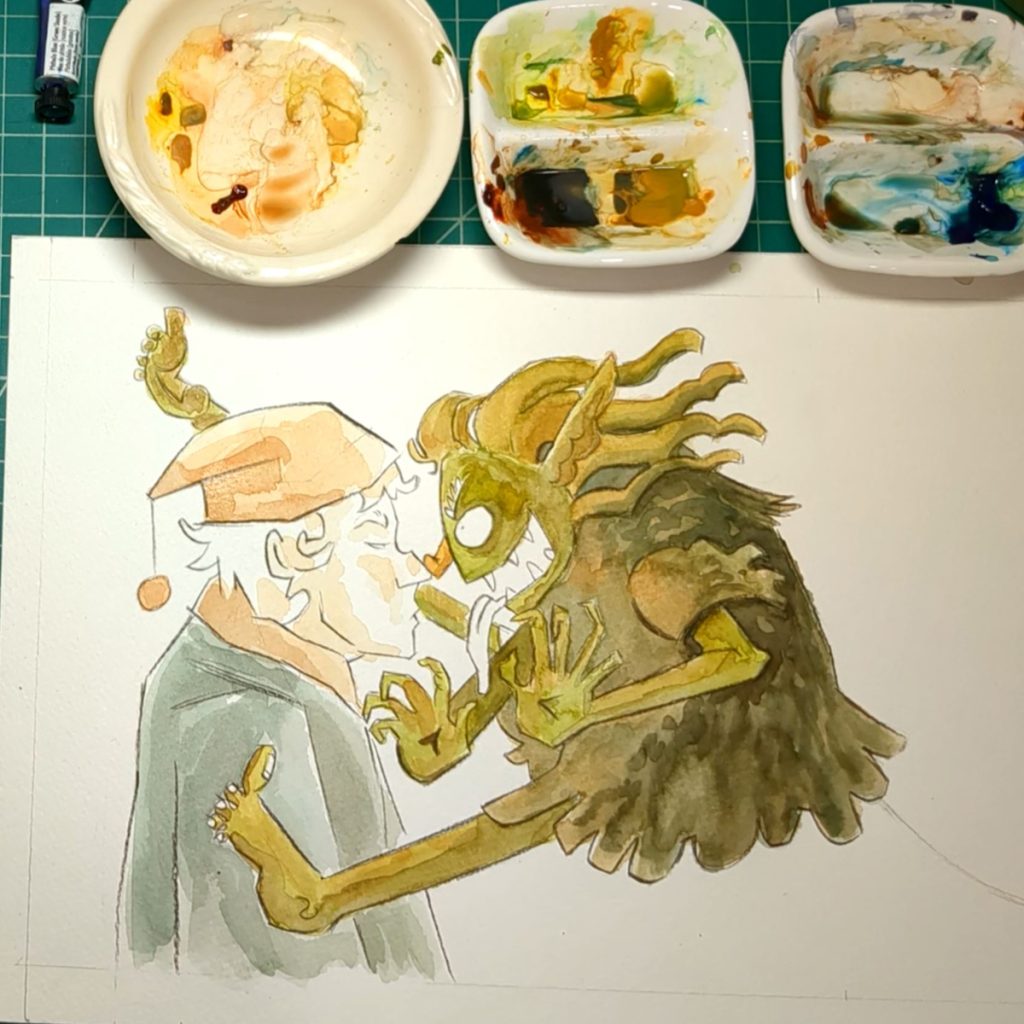
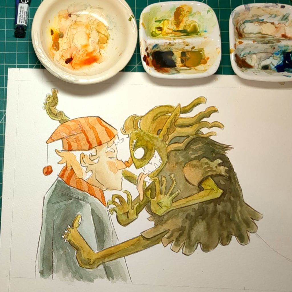
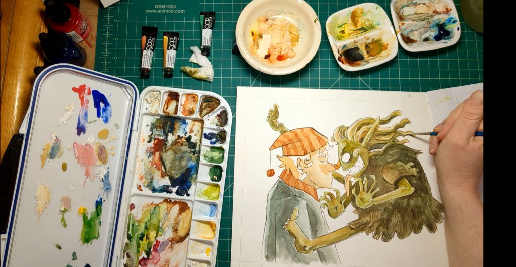
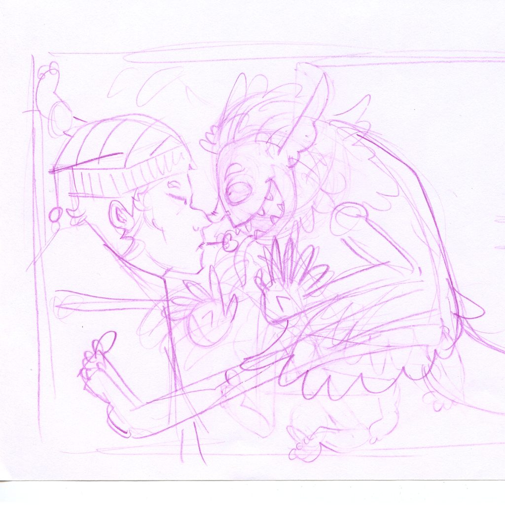
Water color is still kind of new to me. I don’t think I did things in quite the right order. I used orange where I wanted the light source to be touching. I wanted those ares to be warm in color.
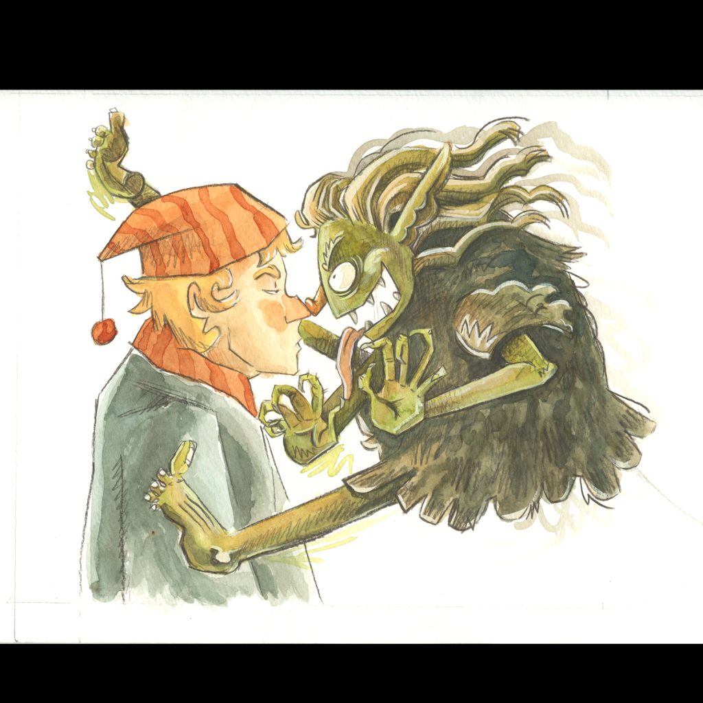
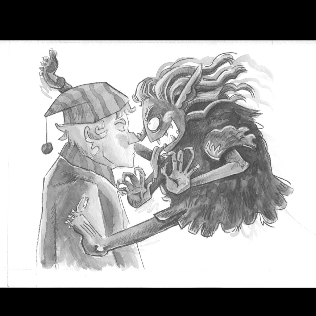
Then I designated where I wanted the darkest shadow to be. While I’m doing this I am remembering that to make things visible, the dark shapes and the light shapes need to work with each other. For example, I want the hand to be visible and pop from the troll, so I keep in mind that the hand will be lighter and the shapes behind it will be darker. To put it simply. Or maybe if I say, I’m not thinking in regards to color but in regards to shadow and light, or tone and value. Does that make sense? When this painting is done I should be able to make a gray value image of it and the shapes should still read just as well as if they were colored. I’ll show that at the end of the video and we will see together if I did it right.
Then I slowly build up the layers and colors. I am trying to experiment with looseness and texture.
I found that I painted too dark. I should have maybe left some white in some places.
To fix this I used a damp paint brush to activate the paint on the paper and I used a paper towel to dab the wet paint off. Then, I thought this would be a very bad idea, but I tried it anyway: I made my highlights with gouache with a little bit of the watercolor mixed in. It went ok, scary but ok, maybe not great but maybe fine?? It’s ok. I think next time I will try very hard not to color the whole figure and leave some space white. I think this would help with the energy of the illustration.
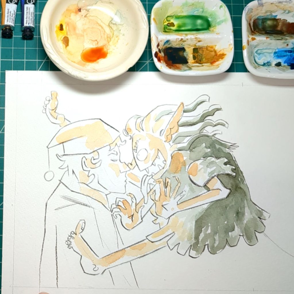
Above: The process and slow built up of watercolor
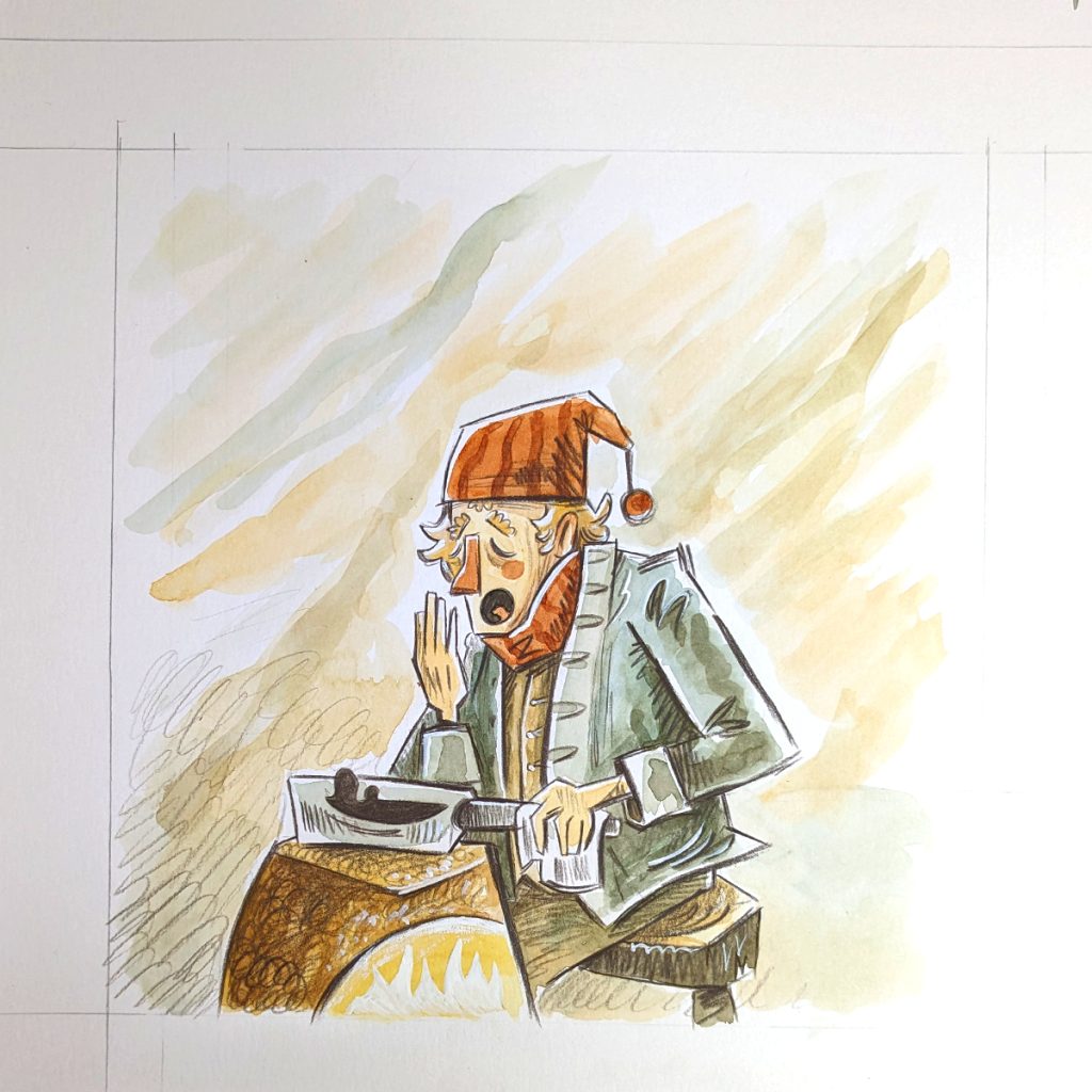
The guy was pretty straight forward. I like the stripes in the hat and scarf. I think the natural texture of the watercolor works very well there
It was looking too clean so I scribbled some watercolor outside of the lines of the creature. And I like this a lot; I think it adds motion and energy to it.
It’s hard for me to break out of my habit or being neat and clean, but I’ll get there. (>_<)
After the painting was done I went over to add embellishment with the procolor pencil. Final painting below.
Conclusion
Above: The finished painting and the same image in gray scale to show values.
So there is one page painted. The painting has some texture but it is a little cleaner then my intention. I really like scribbling with the pencil to make shadows.
I can see in the grey image the value it pretty good. Though the value between the trolls foot and the man’s shirt is close I don’t think I will change this since the focus is about the faces. If you look at the troll arm against it’s body you can see it reads very clear. And that’s what I keep in mind as I color and shade.
Overall it looks okay. I will put it aside and start the next page and look at this again later with fresh eyes.
Next Time!
There are something like 18 pages to paint. So the next video will be more painting! I’ll make every video unique and interesting to the process so things do not become repetitive and you are not just watching me paint for hours and hours.
I am making notes of topics to make videos about. If there are any particular questions you have please feel free to comment below. So far I have been sharing the things I notice. And maybe I am overlooking things that are interesting to you. Or maybe I need to go into more detail about a topic. Let me know!
Now that I had done some fooling around with different medium, I have made an assignment for myself. (I’m also just really excited to put these new to me ideas to the test and am maybe a little impatient, so time to make a book!).
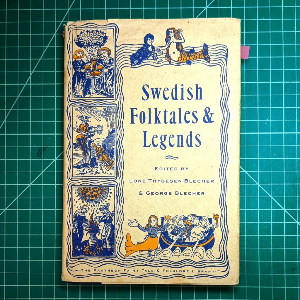
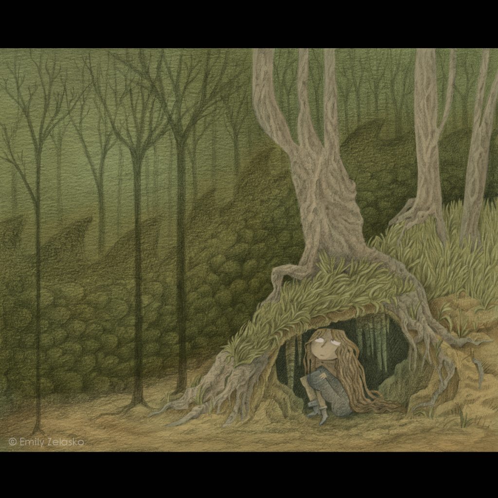
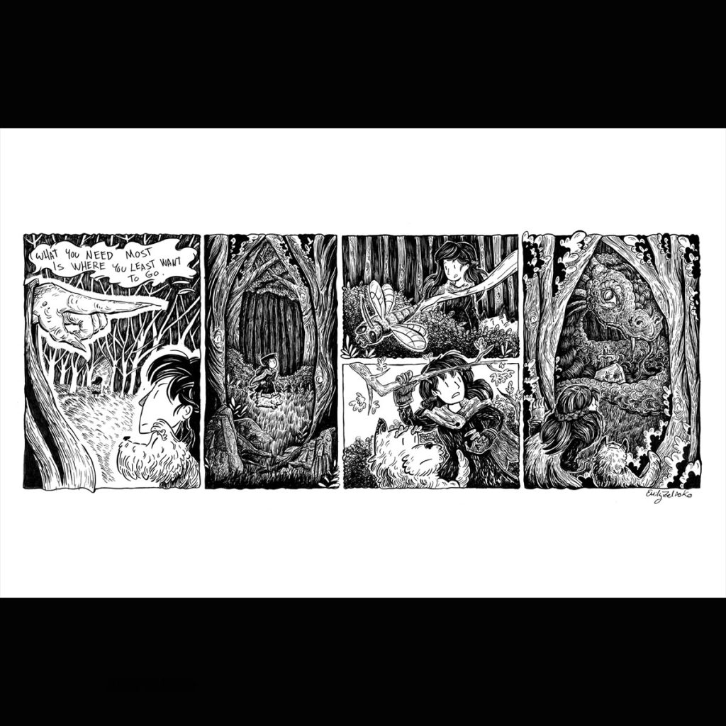
I looked through some folk tale books I had and decided to choose “Skogsrå at Lapptjärns Mountain” from “Swedish Folktales & Legends” by Lone Thygesen Blecher & George Blecher. It sounds like a mouthful, but it’s a simple funny story, so I thought this would make for a good test.
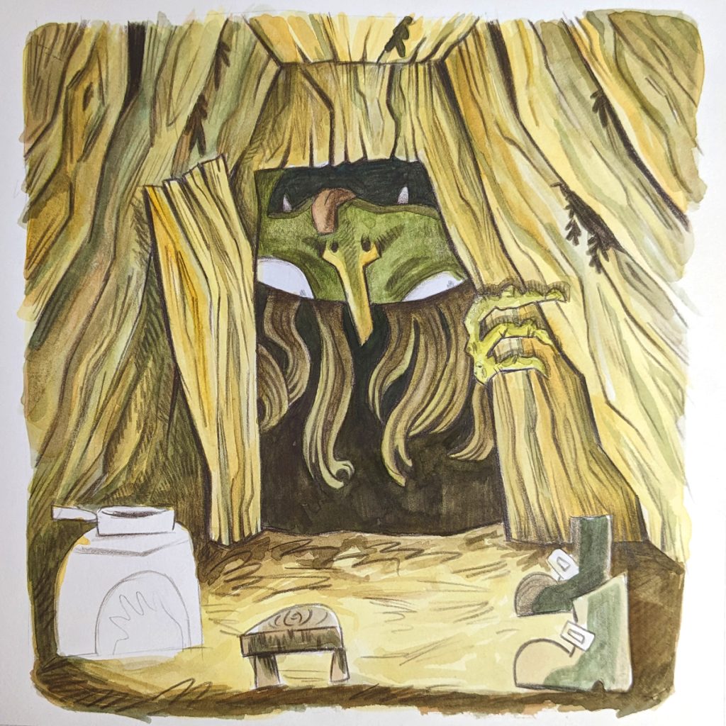
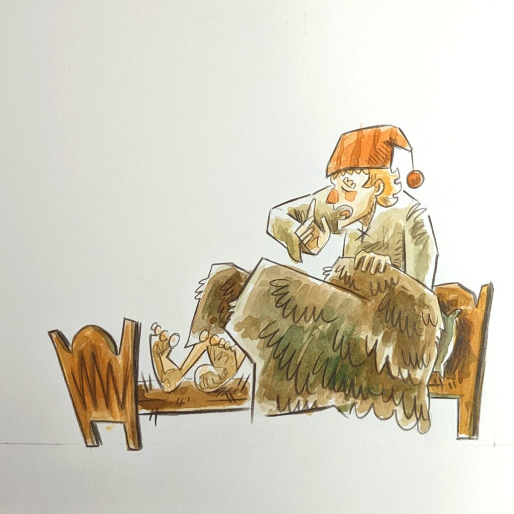
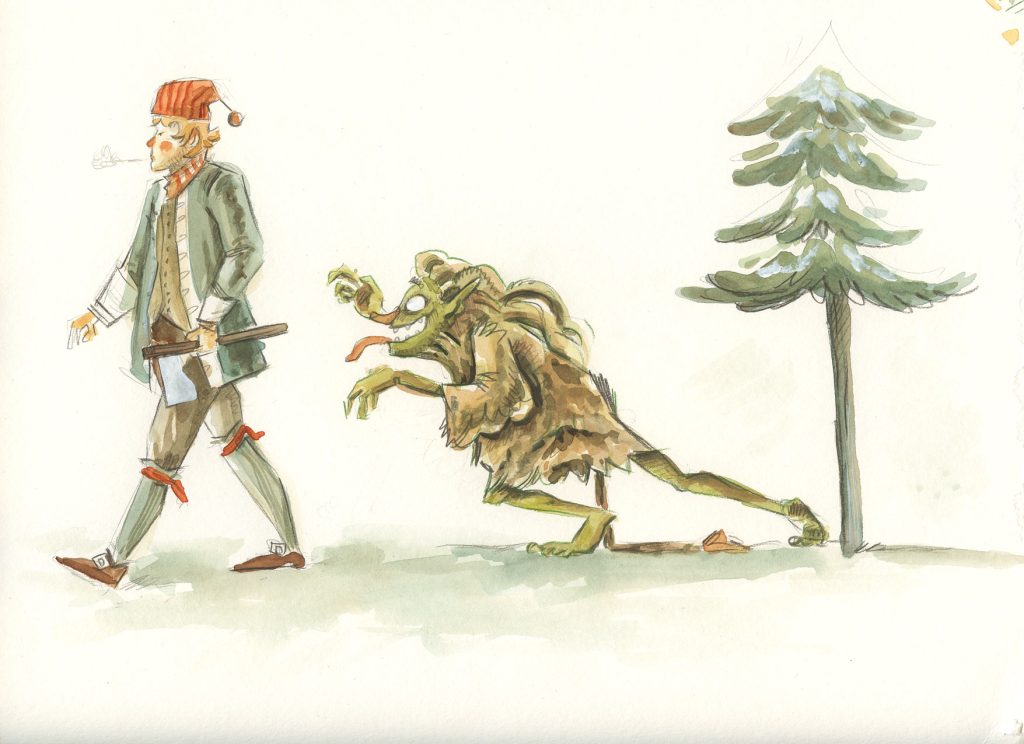
The story is about a man who works in the woods as a charcoal burner and is being tormented by a Skogsrå. The creature teases the man and asks of his name. But the man, not wanting to give his name to a troll says “My name is myself”. The man is not afraid of the creature however night after night the creature comes to the doorway of the man’s cabin and yells and yells with its big mouth, resulting in a very sleepy charcoal burner. The man thinks of a plan to remedy the situation. And one night while waiting for the creature to arrive the man prepares a boiling pot of tar. Then, when the creature takes it’s place in the doorway and begins its yelling, the man tosses the tar into the creature’s mouth. The creature run outs into the woods in pain and panic yelling “myself has burned me, myself has burned me!” And the reply from the woods and the creatures in the woods is “you burned yourself? Then you only have yourself to blame!” And in agony and probably embarrassment the creature runs away leaving the charcoal burner in peace.
Now my assignment is to turn this folk story into a picture book.
Research and Reference
I can’t just get right into drawing, though. I need to do a bit of brain storming and research. A few main points I look into are charcoal burning, what it is, what would charcoal burners wear, and how would they live. I also looked into the Skogsrå creature.
I do research because it gives me more ideas and references to work with. I also like to learn about the folk stories and the world around them. Personally, I find historical everyday living interesting and use the opportunity to learn about it and pass it on in my art. (n_n)
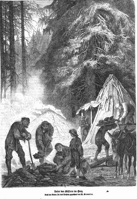
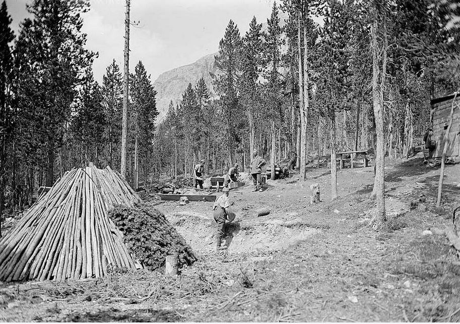
The main character in the story is a charcoal burner. Charcoal burners are men who would live in the woods and make charcoal to sell akin to what we may use today for barbeque. They would make charcoal by cutting down trees and building a big fire stack. The stack had to be constantly tended and burn slowly to produce the charcoal. A very laborious job.
Why make charcoal? This was very important to the smelting of iron, which leads to the development of tools and society and so forth. Sound very important and something I didn’t know about until looking just a little more closely at this story.
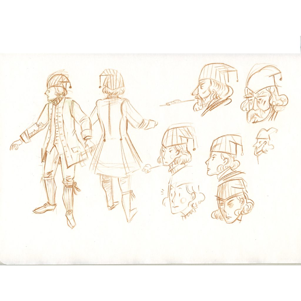
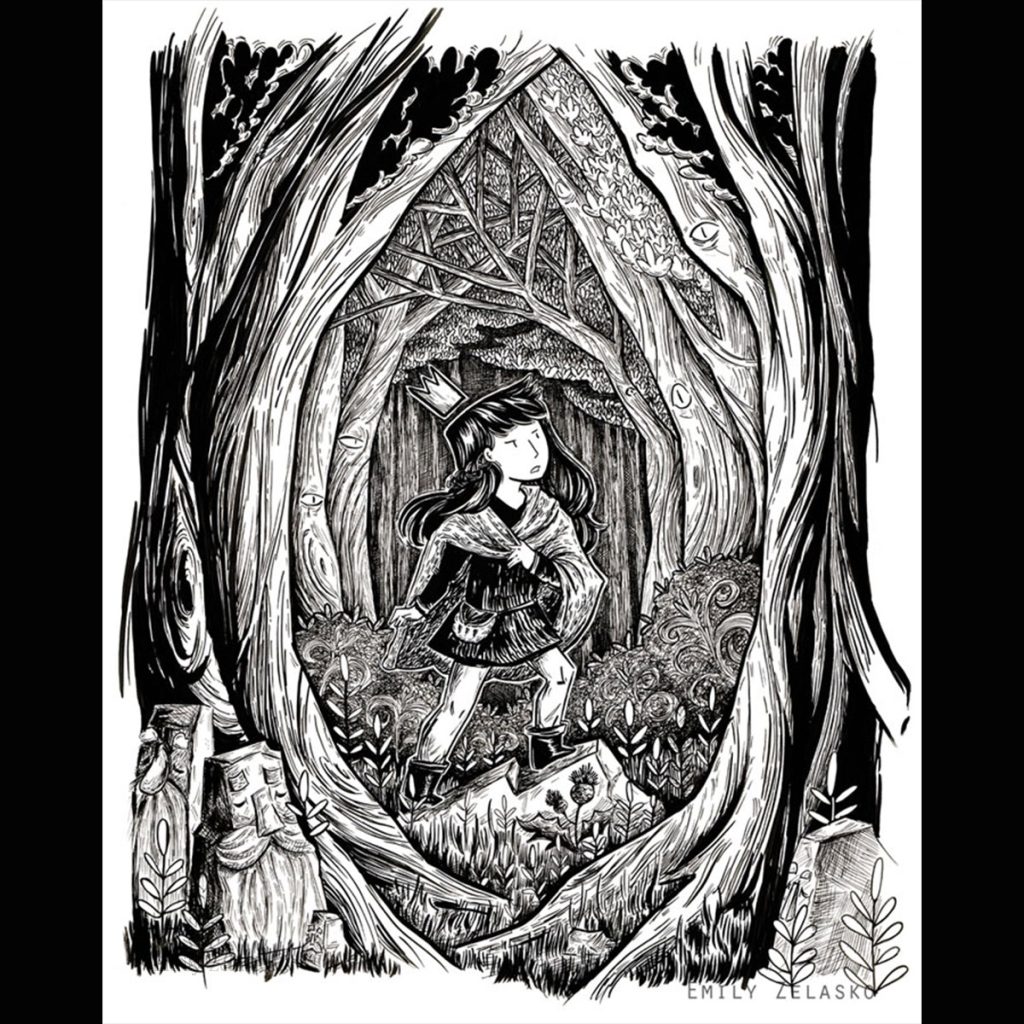
Charcoal burners, I believe could wear whatever they wanted, probably a rough shirt and pants, something to keep warm in, but I gave my character more recognizable clothes to place him in 1800’s Sweden.
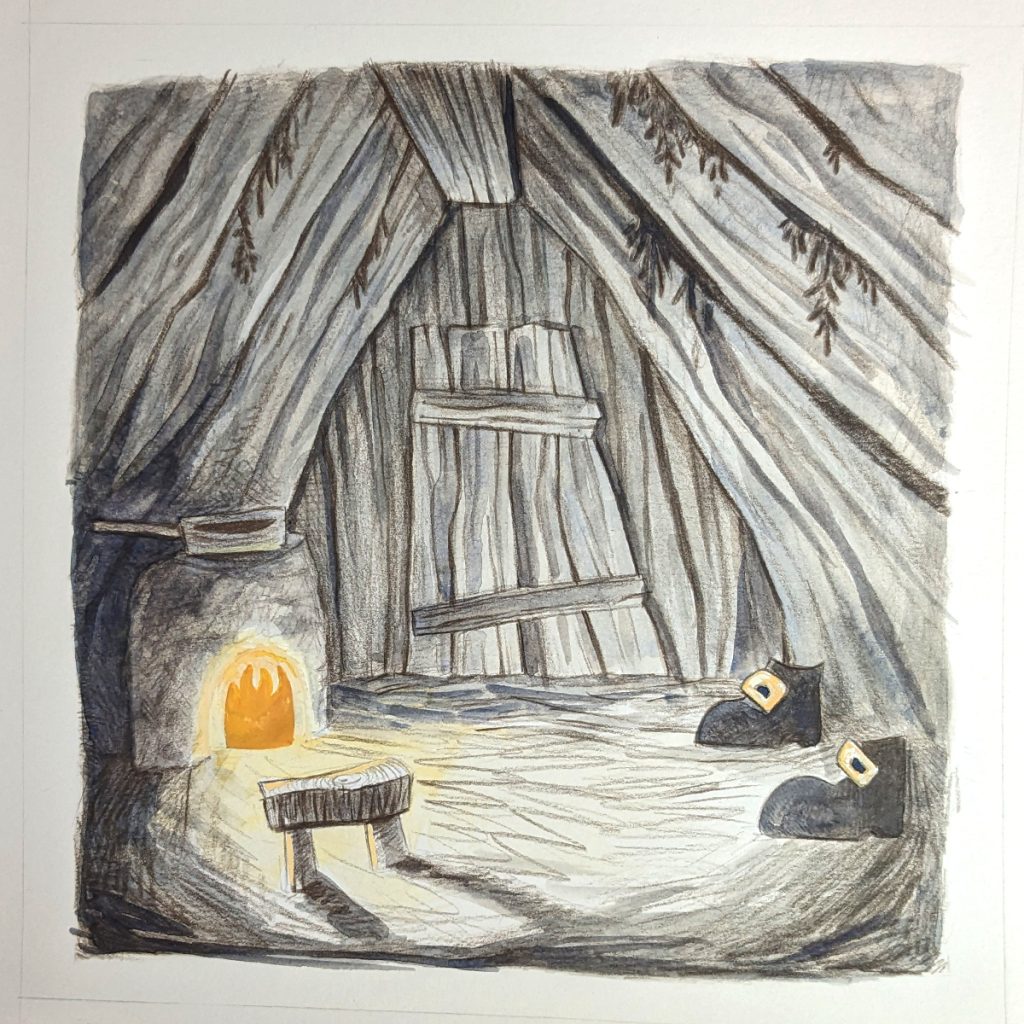
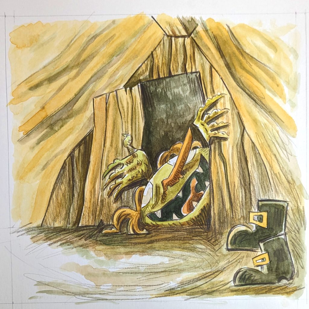
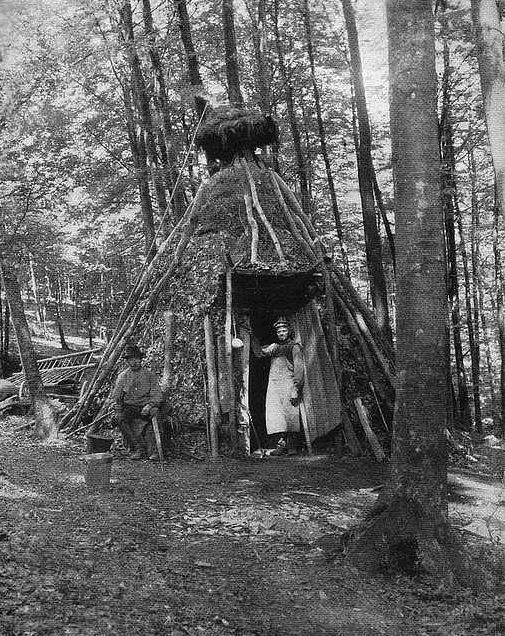
Charcoal burners live in huts. Because they moved around a lot, going from one forest to the next for wood, these huts were of simple construction and just large enough. They were often triangular like an A-frame, made with planks of wood and insulated by putting dirt and moss on top. They would have a little fireplace and a hole for the smoke to go out.
Images and illustration of Charcoal Burners. Images from picryl.com in public domain.
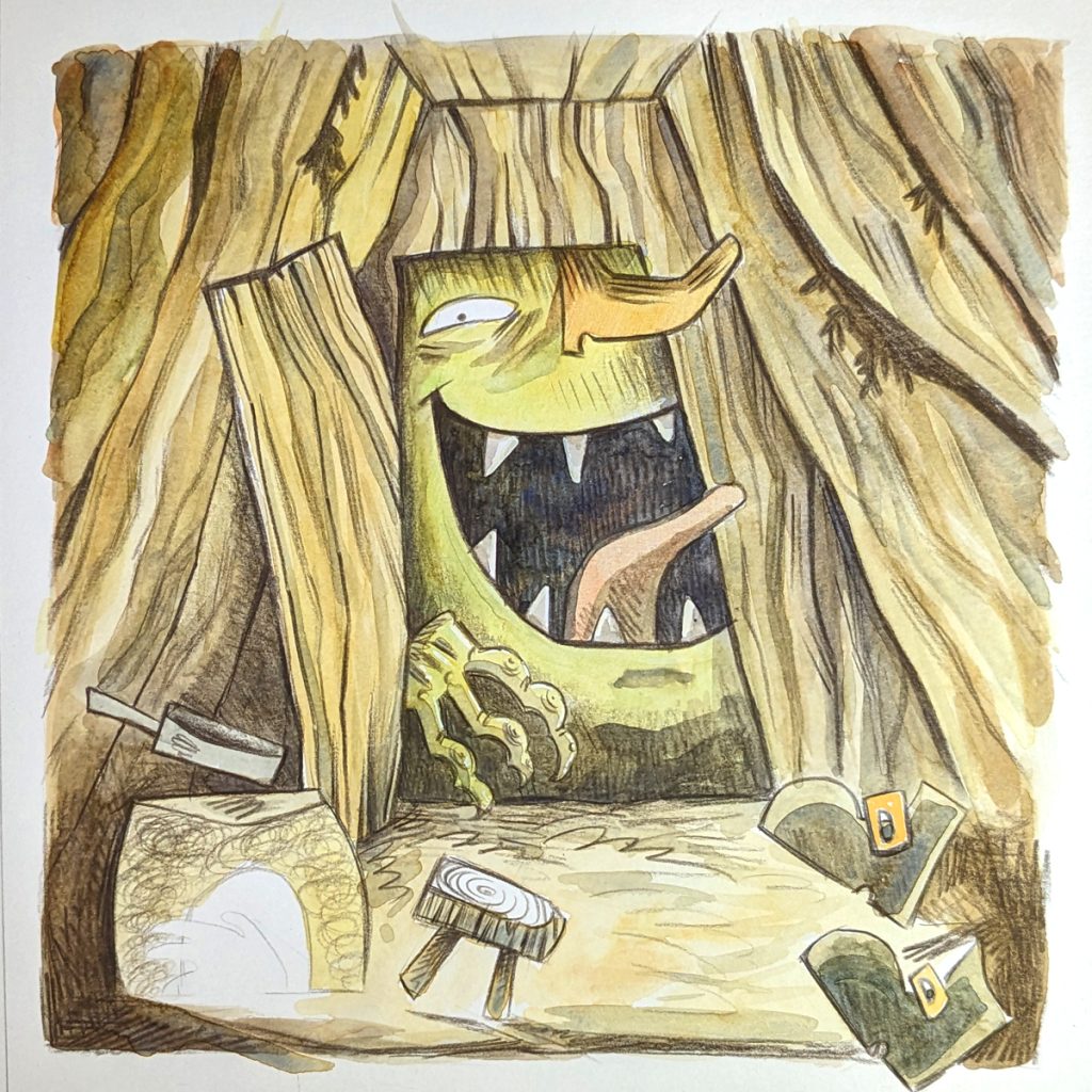
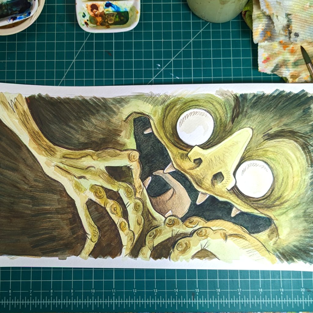
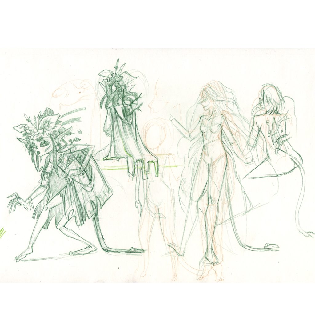
The next main factor was the creature: The Skogsrå!
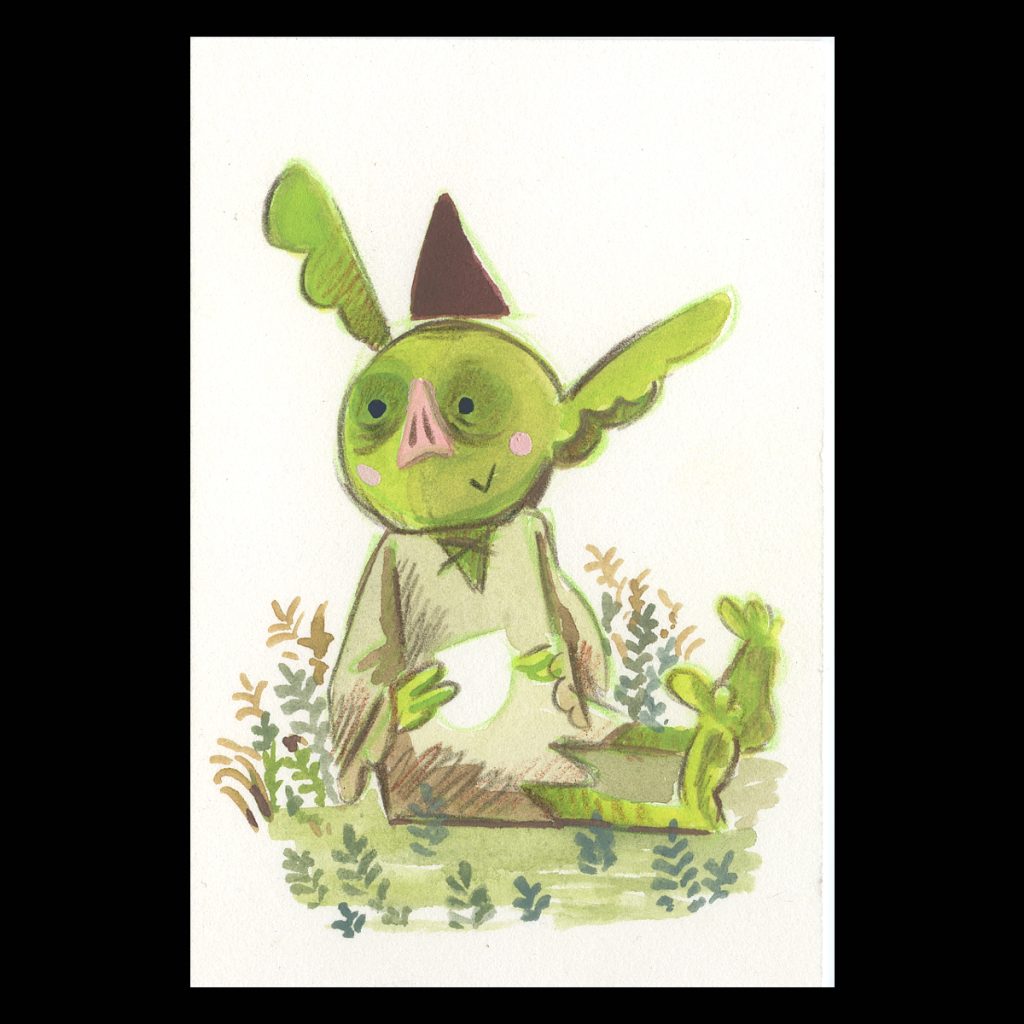
The Skogsrå is a lady sprit of the woods. She can have a tail. She can have a hole in her back or her back is covered in bark (She tries to hide this.) She is also a temptress to men in the woods. Even though these elements do not appear in this telling of the story, I like to keep them in mind for the design of the character.
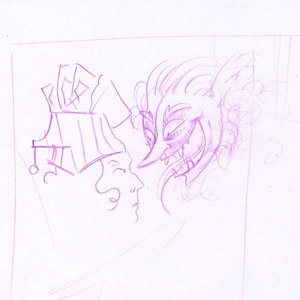
Above sketches of the charcoal burner and the Skogsrå
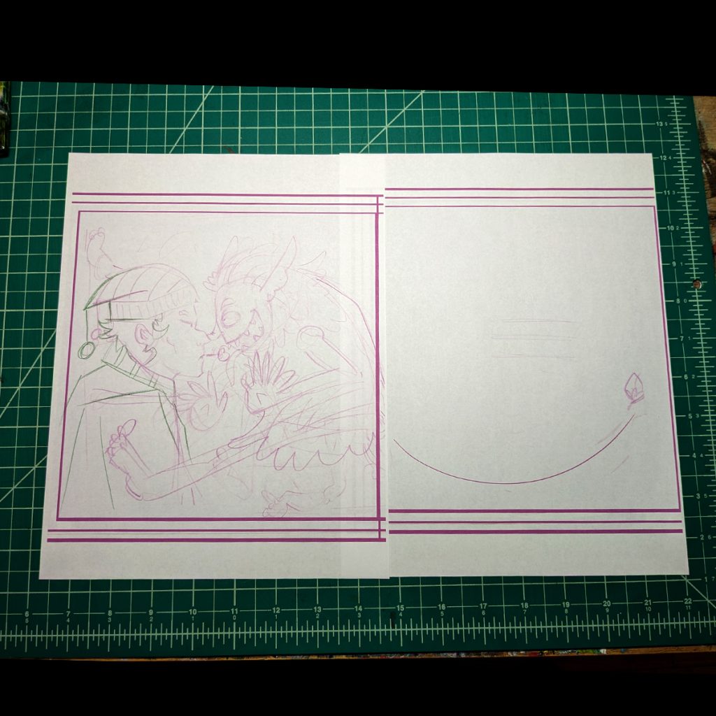
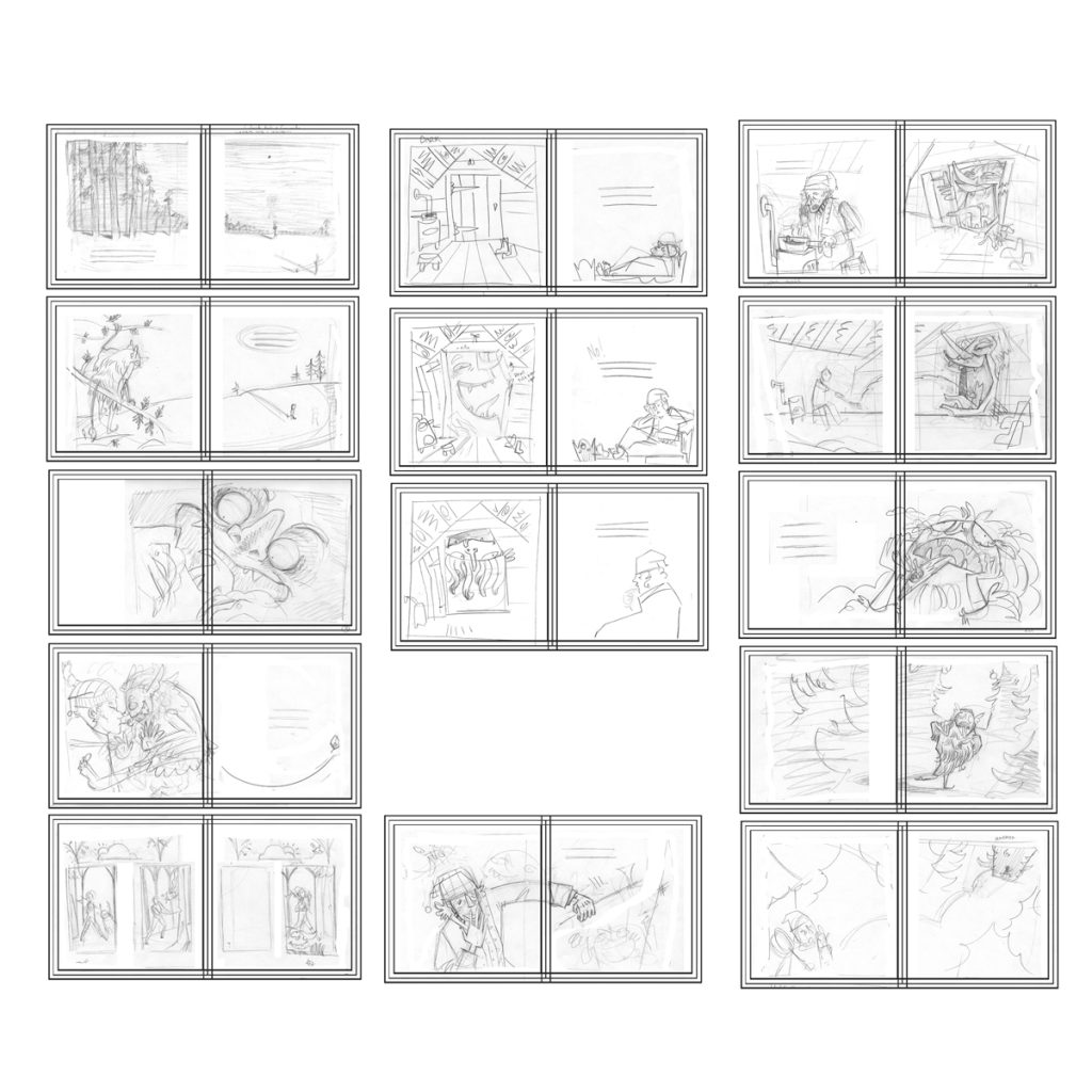
Layout and Sketching
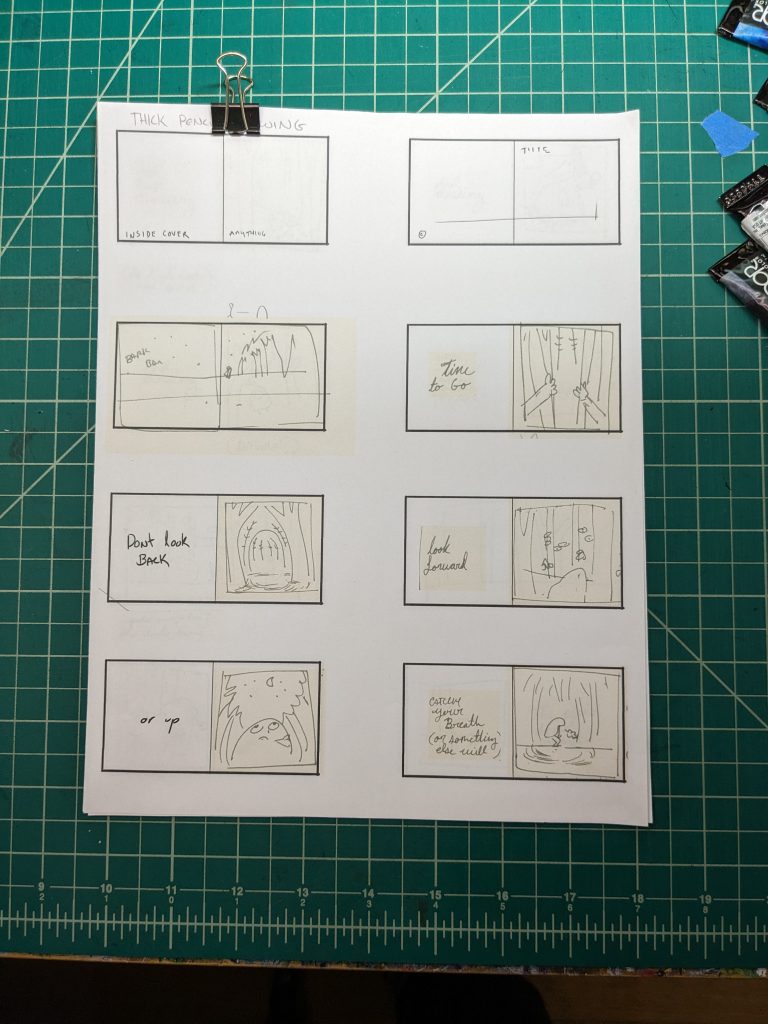
Next, I did a really really rough lay out to pace the story and figure out the page count. Once that was figured out, I started sketching.
When I make a book, I like to have loose pages. This way, I can flip through and rearrange them. So, I do the sketching on loose paper. Here I used regular printer paper that I cut in half.
Lots of drawing and redrawing. At this point I am putting down ideas, working out problems, and discovering new problems.
It is at this point in the project, doubt set in. I was having second thoughts and thinking about tossing the whole thing. (that did not take long) If I had quit, though, that would have defeated the purpose of the assignment: to use new methods and mediums to create a story. Anyway, I should be able to problem solve and make any story interesting. That’s my job. So I treated it as if someone else told me to do the book and I kept on.
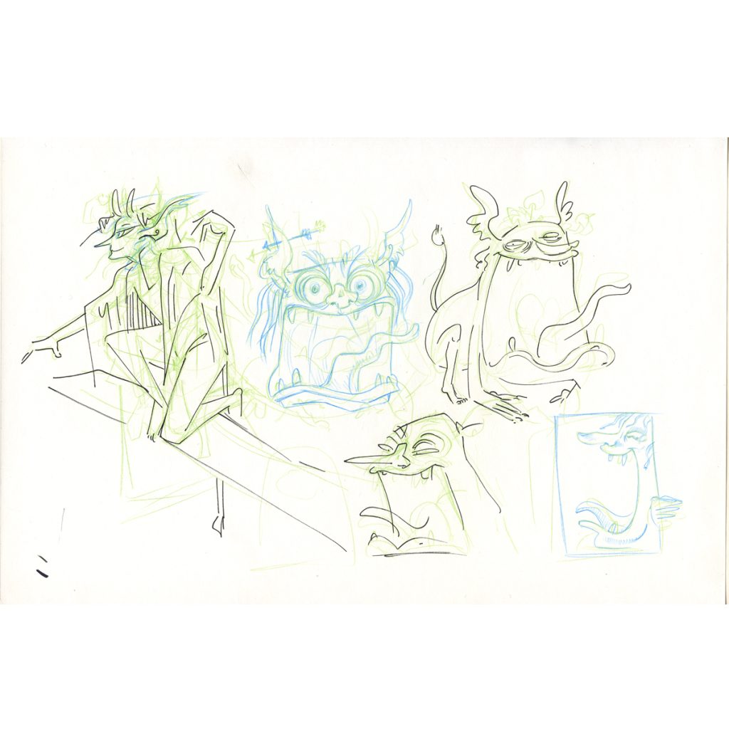
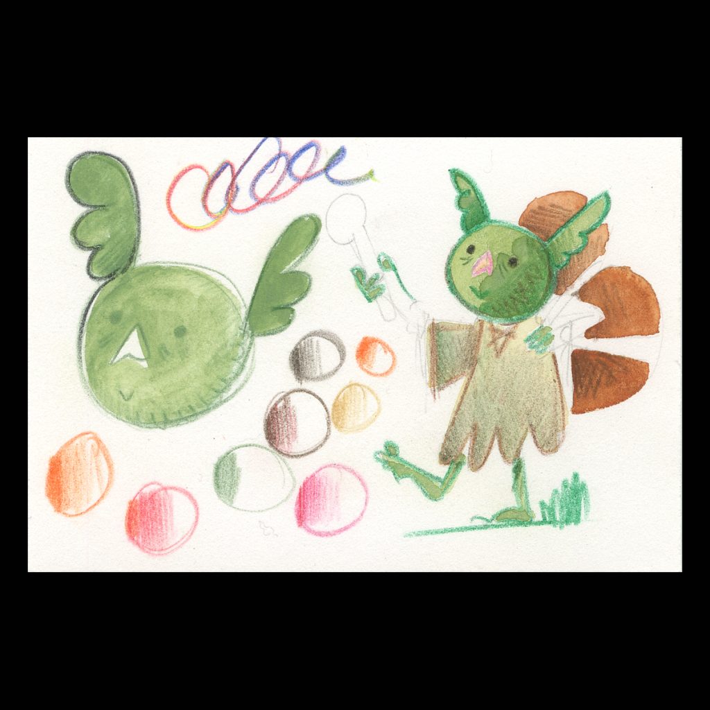
The design of the Skogsrå was giving me a hard time.
I first drew her as a women. I wanted her feminine but it was not fitting the vibes. The more I thought about it, and the more I thought about sending her away crying at the end, the more it did not set right with me.
I did not want her to come off as a temptress at all. I also did not like making the lady cry. Another time, not this time.
So, I ended up leaning into the creature side of it.
After I gave myself permission to draw her like a troll and see how it looks, I felt better about the design.
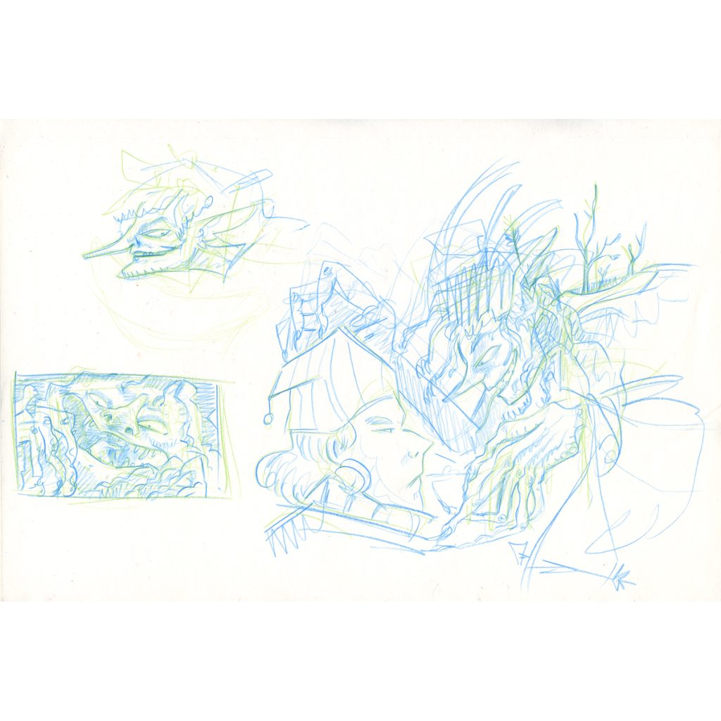
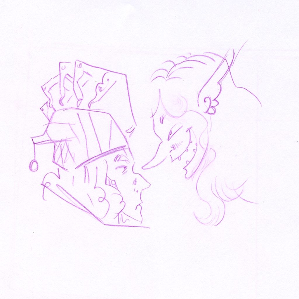
I was also hung up on how to draw the door frame. I was over thinking. I just need to sit down and scribble and not care. The more time the pencil is on the paper the more things reveal themselves: If thinking does not work then just draw.
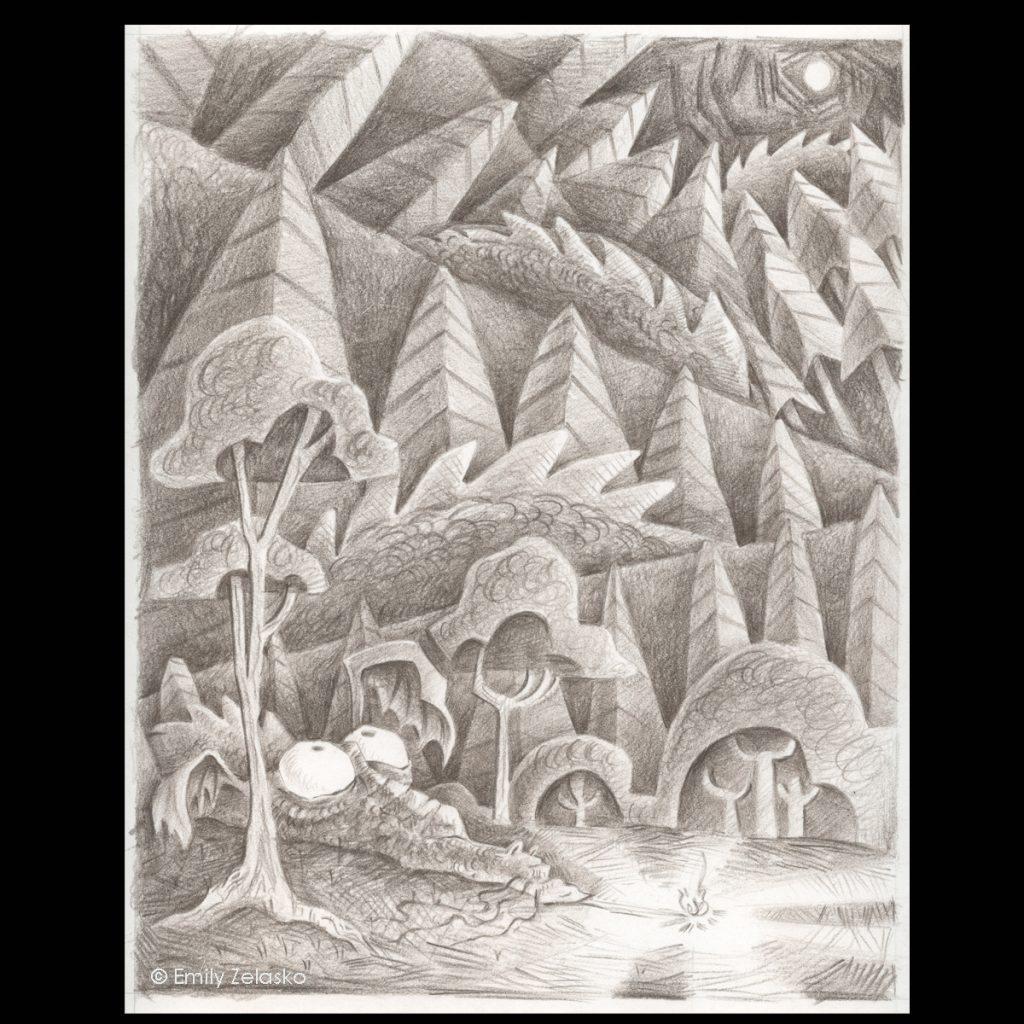
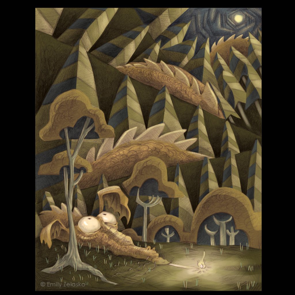
I can not find my thumbnails for this story (x_X) but they would look something like this above
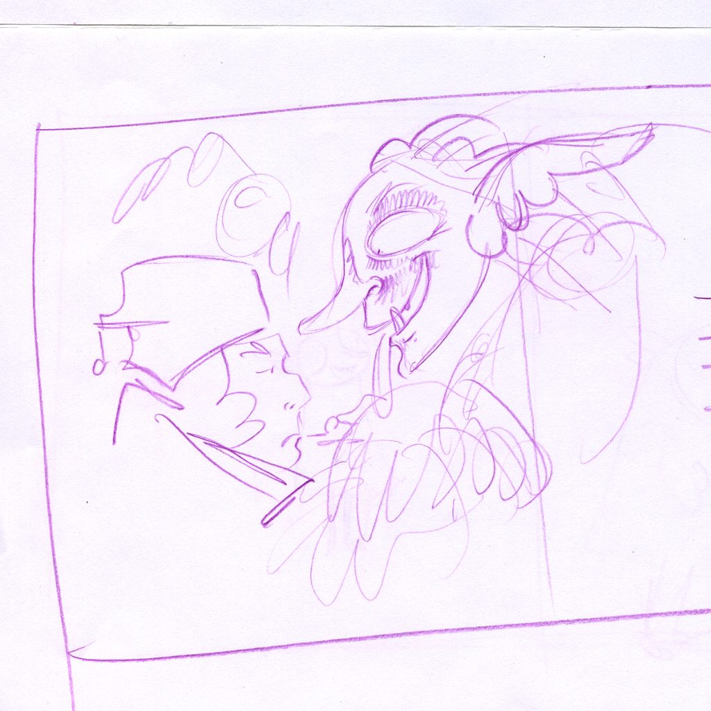
The struggle with Skogsrå
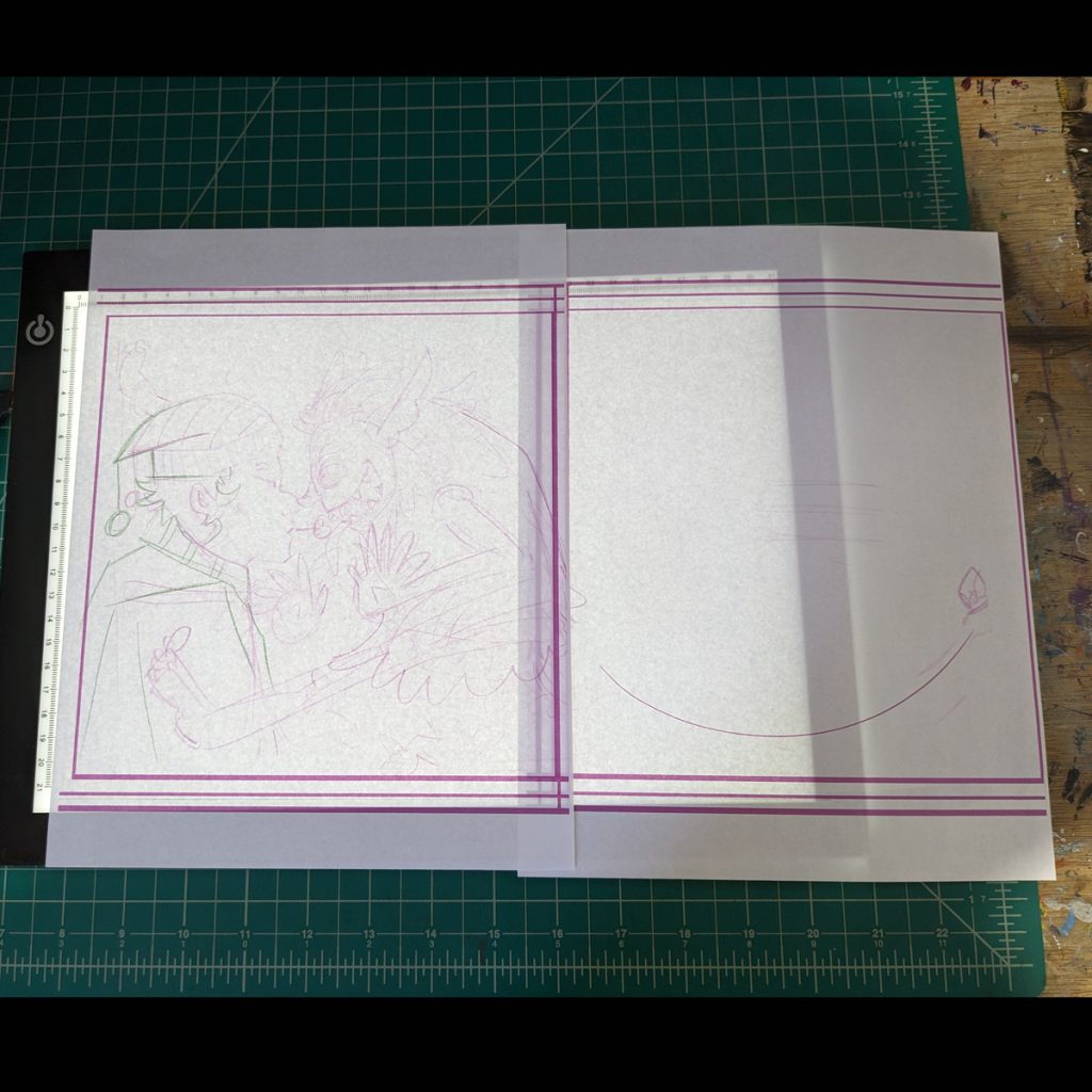
So I drew the story once, then I drew it again and again until I had some sketches and composition I was happy with.
If I liked something about a drawing, I would use my light box to trace on a new piece of paper what I wanted to keep then redraw in the rest.
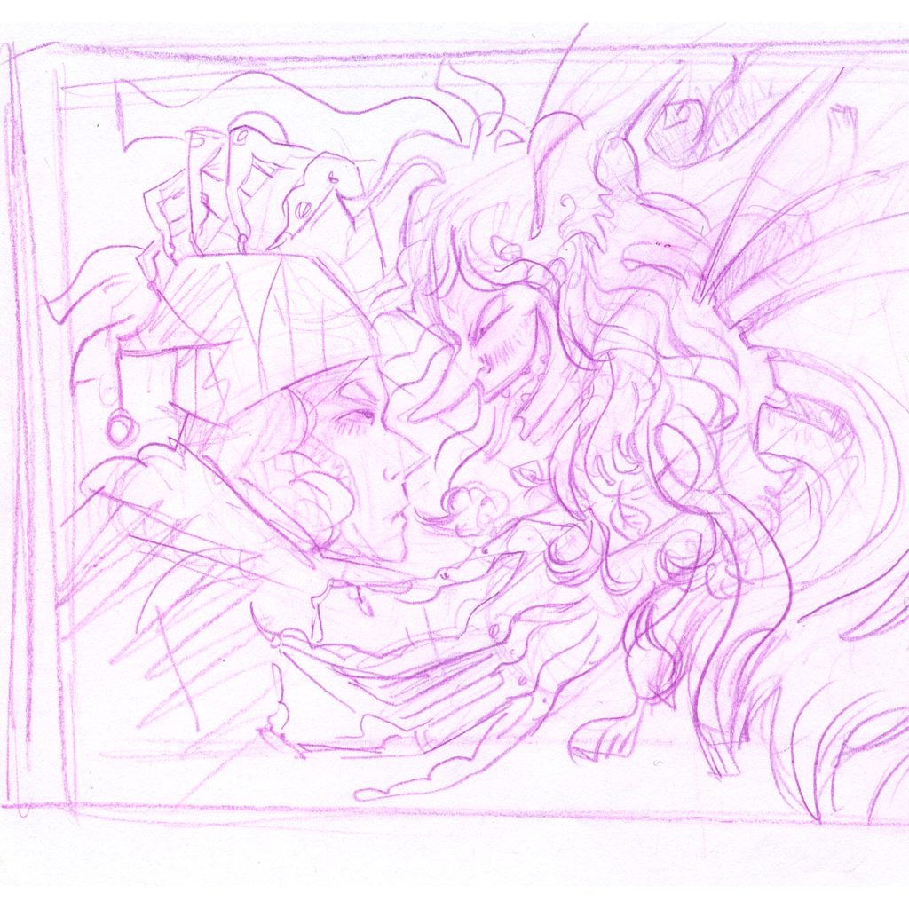
During this process I did notice a bad habit sneaking up: The habit of drawing what I think is expected. Specifically, with the round shapes and such. So, I went back with design in mind and made some adjustment. Putting in hard straight lines verses the puffy round lines. It’s all mind games!
My more finished sketches and page layouts
Some Technicals:
Here are a couple important things to think about while designing the layout: -the size of your final book and the trim -where the words are going to go
“Live space” is the safe space. Your important text should be within this area. Trim is about where the pages of the book will be cut. Bleed extends outside the trim and is for colors or images that you want to go to the very edge of the page.
The bleed can vary a little bit from printer to printer.
I am making this book a square. 8.5 x 8.5 inches seems to be a standard book size. I think, for this book, I will keep all my images in the live space and not have things go off into the bleed.
Also, during the designing of a book, keep in mind where the words are going to go. I have predetermined where the words will go using lines as seen here. (I do not have my final words decided on, maybe this is will hurt me later, but I have some idea. This might be foreshadowing.)
So Far So Good
I still have some pages that are not nailed down, but I can come back to those. For this book I may do things a little out of order. But, I am my own boss. If I am a little stuck on a page or tired of thinking about it I can work on another part of the book and come back to the troublesome page with a fresh brain later.
Because of the nature of my past projects, much of my work had been ink on paper then colored on the computer or all digital. I can paint with acrylic, too, but I do not have much experience in mixed media. Mixed media is combining a variety of materials. I have dabbled for fun but not for any major projects. However I believe mixed media is the direction I want to go for a couple reasons. As stated in the last log entry: Save the energy of the pencil line, become more familiar with more coloring mediums, and get away from technology.
I really don’t like computers. I did Edme all on computers and it served its purpose but with much headache. This is a personal thing. Partly, due to my own incompetence. I also would rather have the art in front of me, in the same world as me, so I can see just what it is with no hidden layers, no misunderstood sizing, no format disagreements, and no hidden surprises or marks. It just is what it is. And I prefer that.
The other reason for mixed media is I want to preserve my pencil lines and the energy of the sketch of the original drawing. It is not uncommon for finished art to lose the energy of the original sketch. This is unfortunate. I have seen this happen with artists I like: their prototype work and sketches are fantastic, but when the project is final, it feels too clean. In my opinion, sometimes it loses some personality. It happens to me, and I want to avoid it. (Nobody wants that I’m sure)
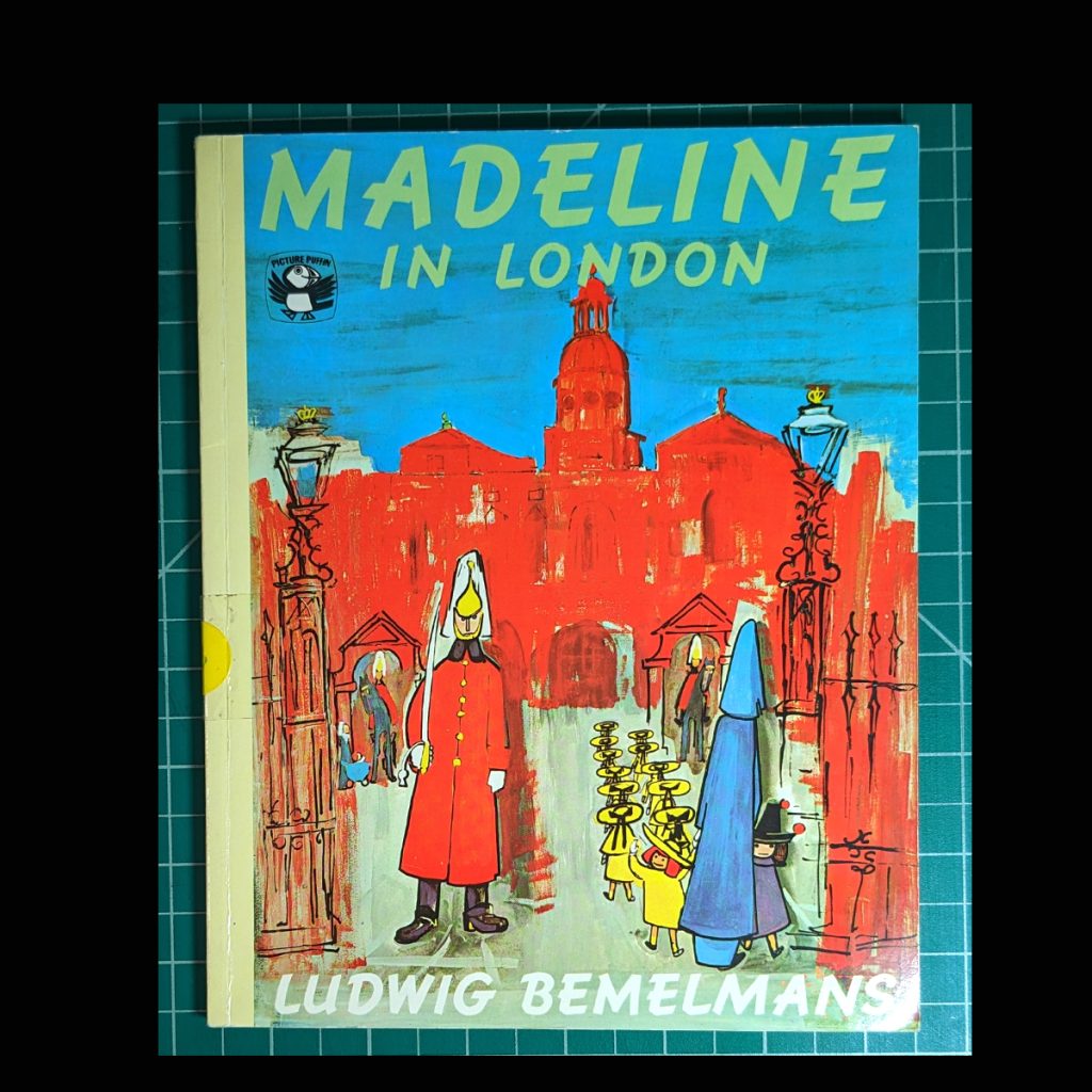
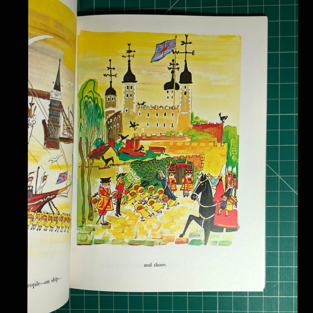
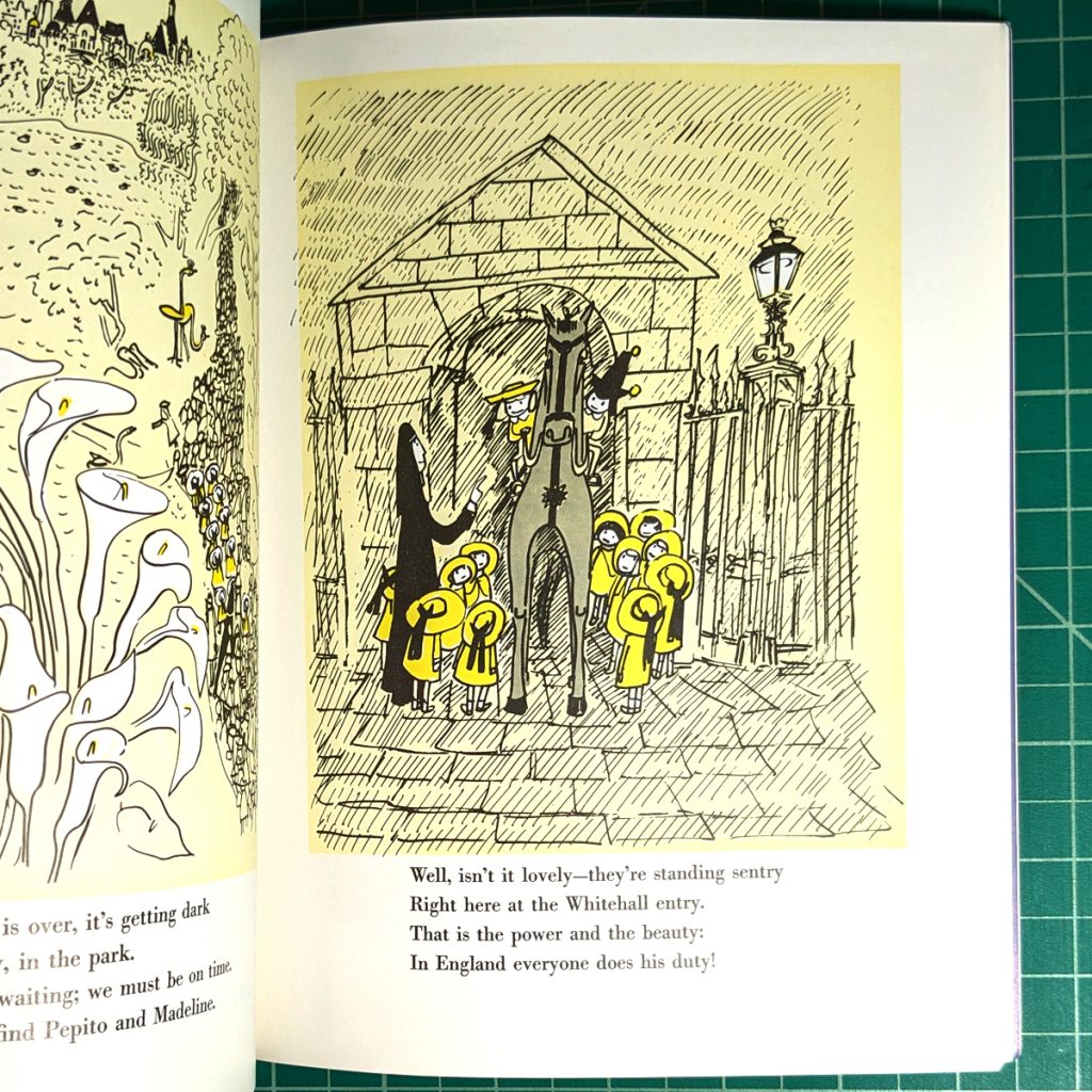
In the past few years I have also been reacquainting myself with older picture books, like Madeline. The illustrations are so crazy looking but it also looks done. I feel becoming more familiar with different coloring mediums will help with this and open doors for me. So, I want to incorporate methods that help keep the energy of the sketch. I want to work with looseness and scribbles and texture. I want to move away from such clean work.
So, now, onto experimentation and over thinking!
I am torn between different styles and executions. This is fine. One can have more than one style. But it is not fine when everything is interesting and you want to do all the projects right now. That is uncomfortable. So, I will look at some methods, one at a time, putting some aside, knowing I will come back to them later.
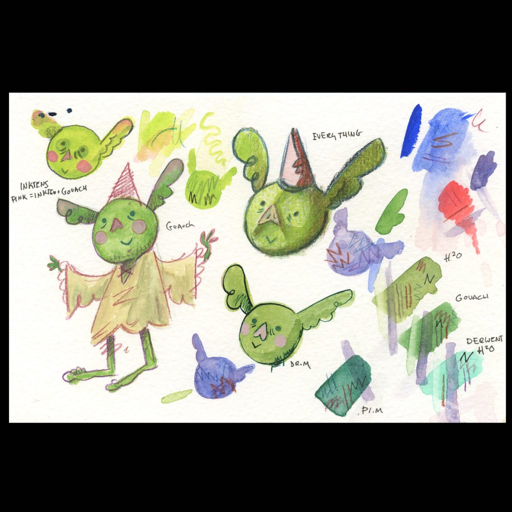
Here is a short explanation of what I have done with different mediums.
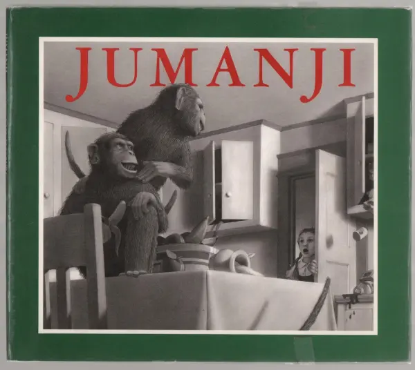
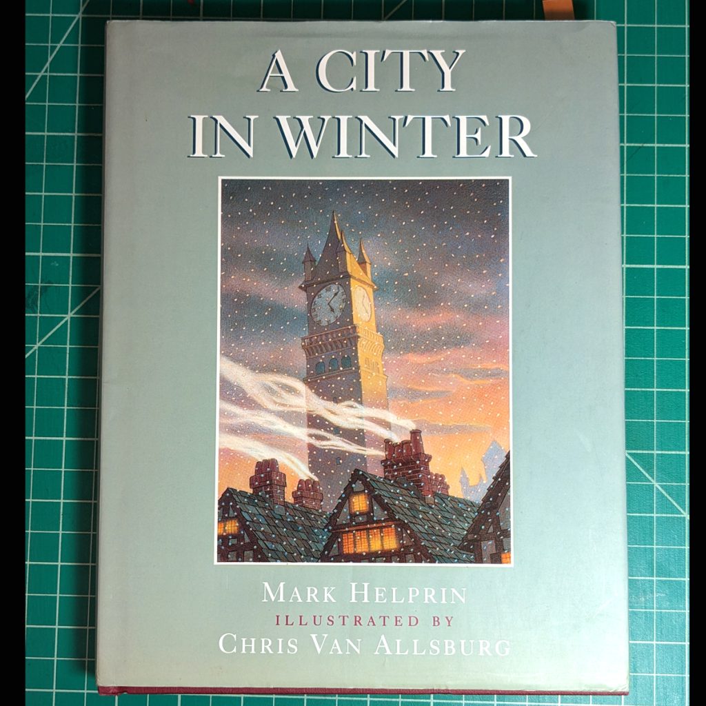
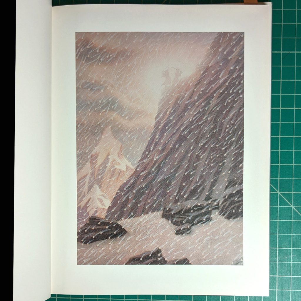
I like the texture and gradient of graphite, like Chris Van Allsburg‘s art in Jumanji. ( also known for The Polar Express). His art has a kind of surrealness to it and it is a bit spooky. I like the vibe of his illustrations as seen also in A City in Winter.
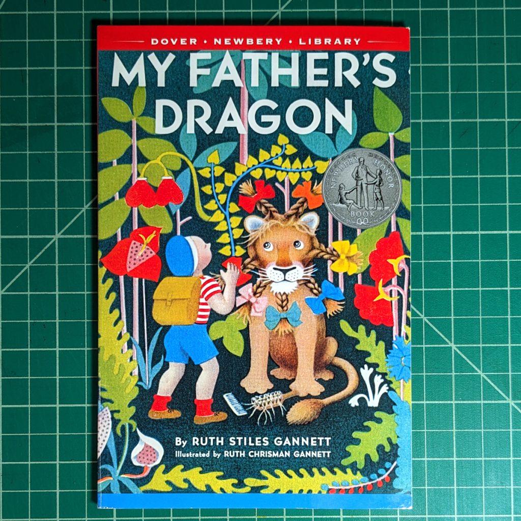
Though I do not know if they are also done with graphite, the illustrations in My Father’s Dragon, art by Ruth Gannett are a similar motivation for me. (My Father’s Dragon has stuck with me since 1st grade when the teacher read it to the class)
1st Row: Art of Ludwig Bemelmans 2nd Row: Art of Chris Van Allsburg 3rd Row: Art of Ruth Chisman Gannett
Thinking about these illustrations led me to the style I would use for the cover of Edme: A graphite drawing that I colored on the computer.
So, as a test I drew out some graphite drawings. But I chickened out and colored them on the computer.
The images above: Right images are the pencil and graphite drawing. Left is color added in with Photoshop)
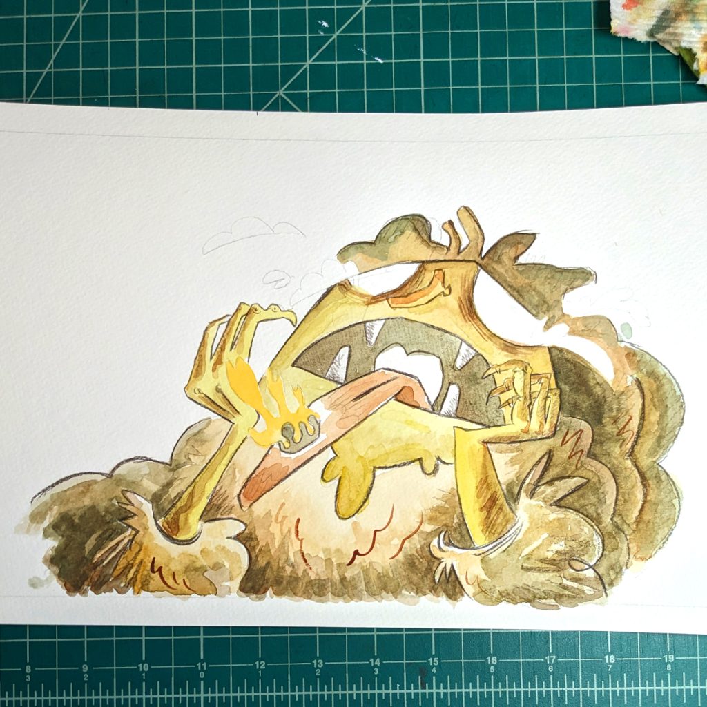
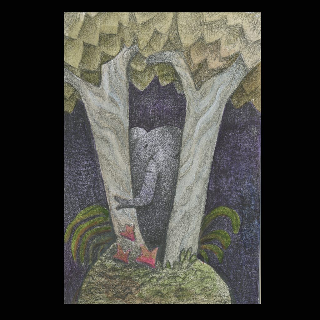
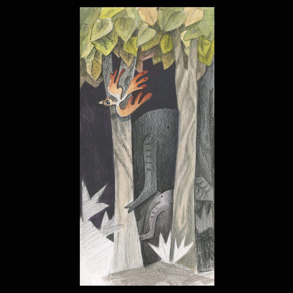
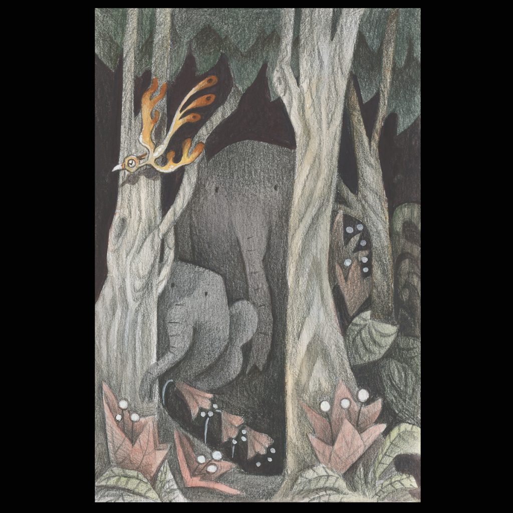
I did this small series of elephants on mixed media paper. Each started with a finished graphite drawing. Then, over the pencil, I used Dr. Marten’s ink, water color, and gouache (in that order).
The Images Above: All done on Strathmore mixed media paper. Under drawing done with graphite. Colored with, from left to right, Dr. Martins Bombay ink, Winsor Newton Gouache, QOR Watercolor.
I think they all came out well. A little hard to tell which way I like better. This way of drawing is a little more time consuming and is more about the shapes then the lines. I like the look of these but I want to solve the line problem so this method is put on hold for now (but I do have a book in mind to be done in this manner)
I also did this illustration with Yupo paper. Making the gradient on the paper and coloring it on the computer. It was interesting. Yupo paper likes to hang onto any mark you lay down. It was also interesting to blend on, and fairly easy to get a smooth blend.
Left : Graphite drawing done on Yupo paper Right: Color added in on Photoshop
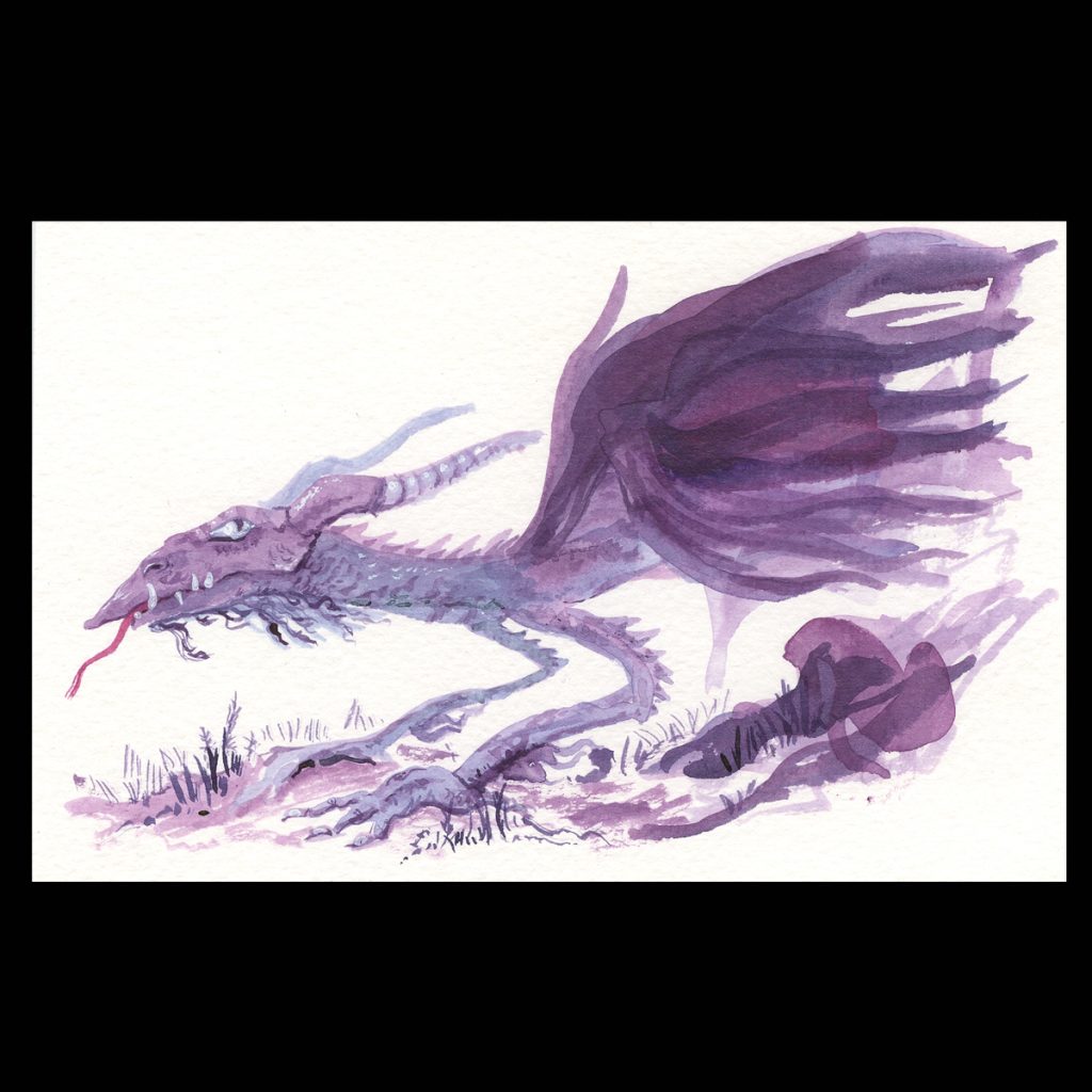
This purple dragon below was done on the fly with Dr. Martin’s ink. These are really my first experiences with the ink. It is very nice. The building up of the transparent layers gives fun effects. What I am not crazy about is that it dries very fast on the pallet I mix the colors on. I can think of work-arounds for this, but I have not found a solution for it yet. (I am using Dr. Martin’s without really knowing anything about Dr. Martin’s. A little research would probably go a long way but I have not gotten around to it yet.)
Next, the bold ink and watercolor is how I did the bagpiper. It is not bad and I did get some good lines out of it. But I think right now I am drawn to pencil lines over ink lines. Ink is very solid and black and maybe I want a softer line that blends with the look of watercolor a little more.
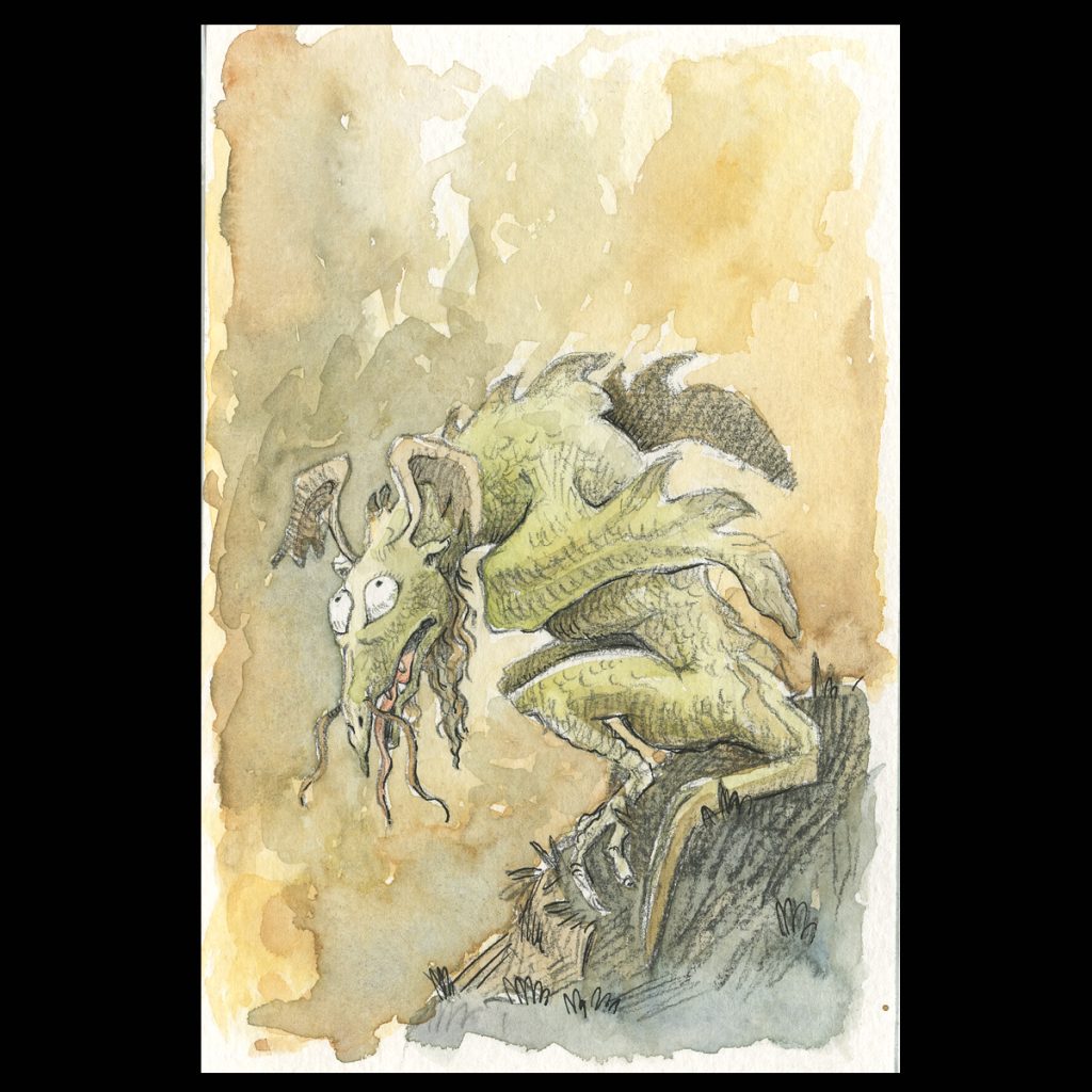
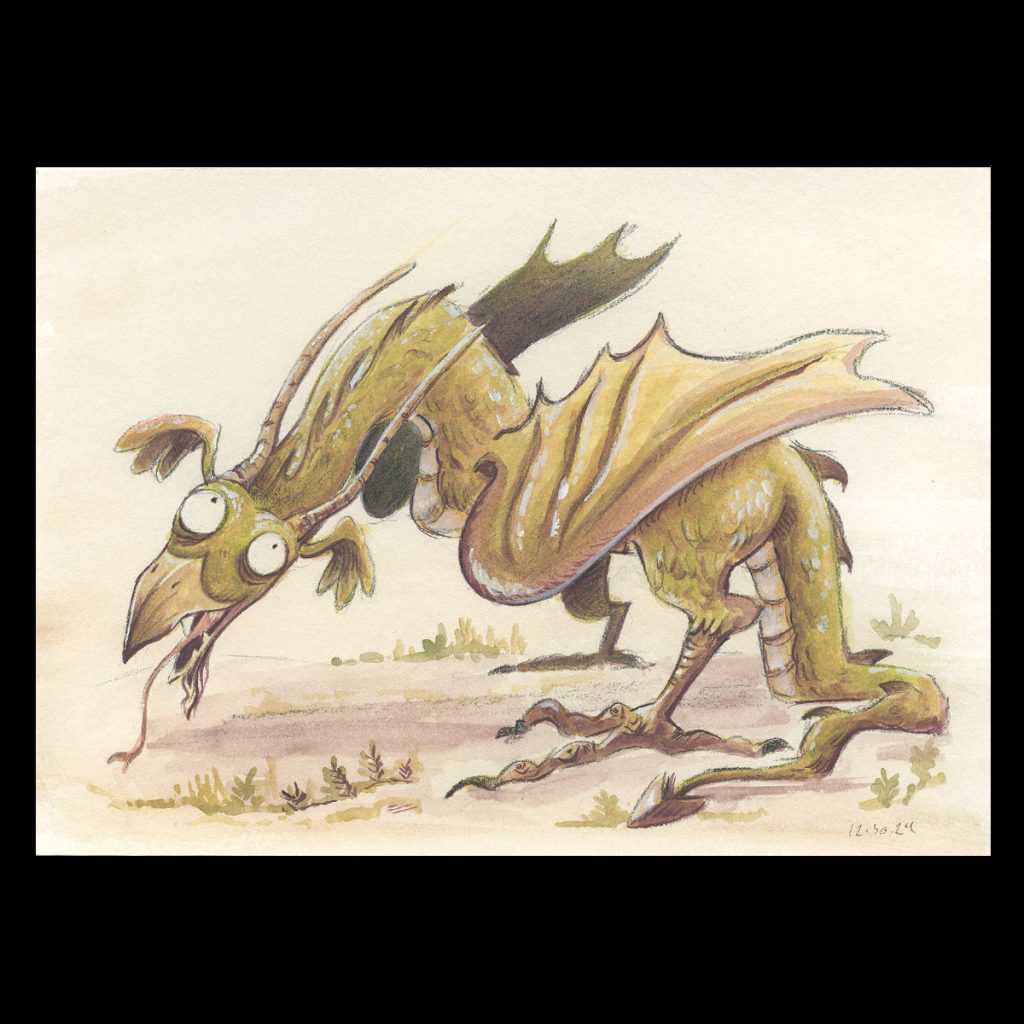
Then this green dragon I like a lot. It was done with a black pencil and colored with gouache and there are touches of ink in it to make a few select parts darker. It is subtle, but has an impact.
From Left to Right: Purple dragon is Dr. Martins Bombay ink, Bagpiper is Winsor & Newton Gouache and Speedball Ink, Dragon is Winsor & Newton Gouache with Prismacolor Black 935 and Micron Pen. All were done on Fluid watercolor paper.
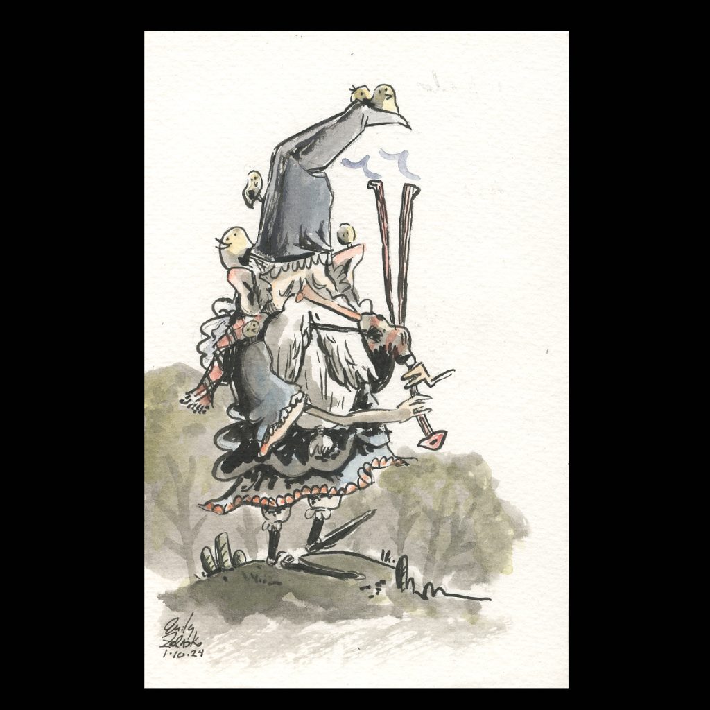
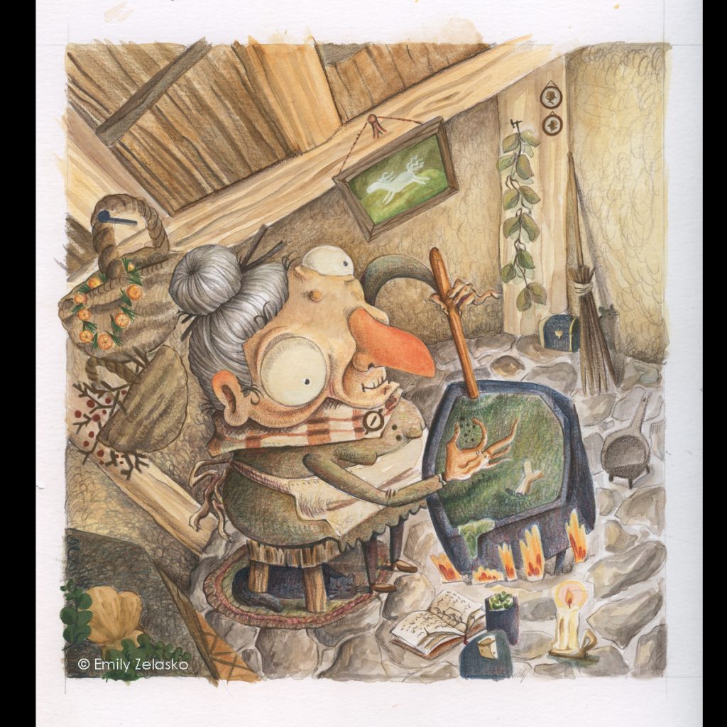
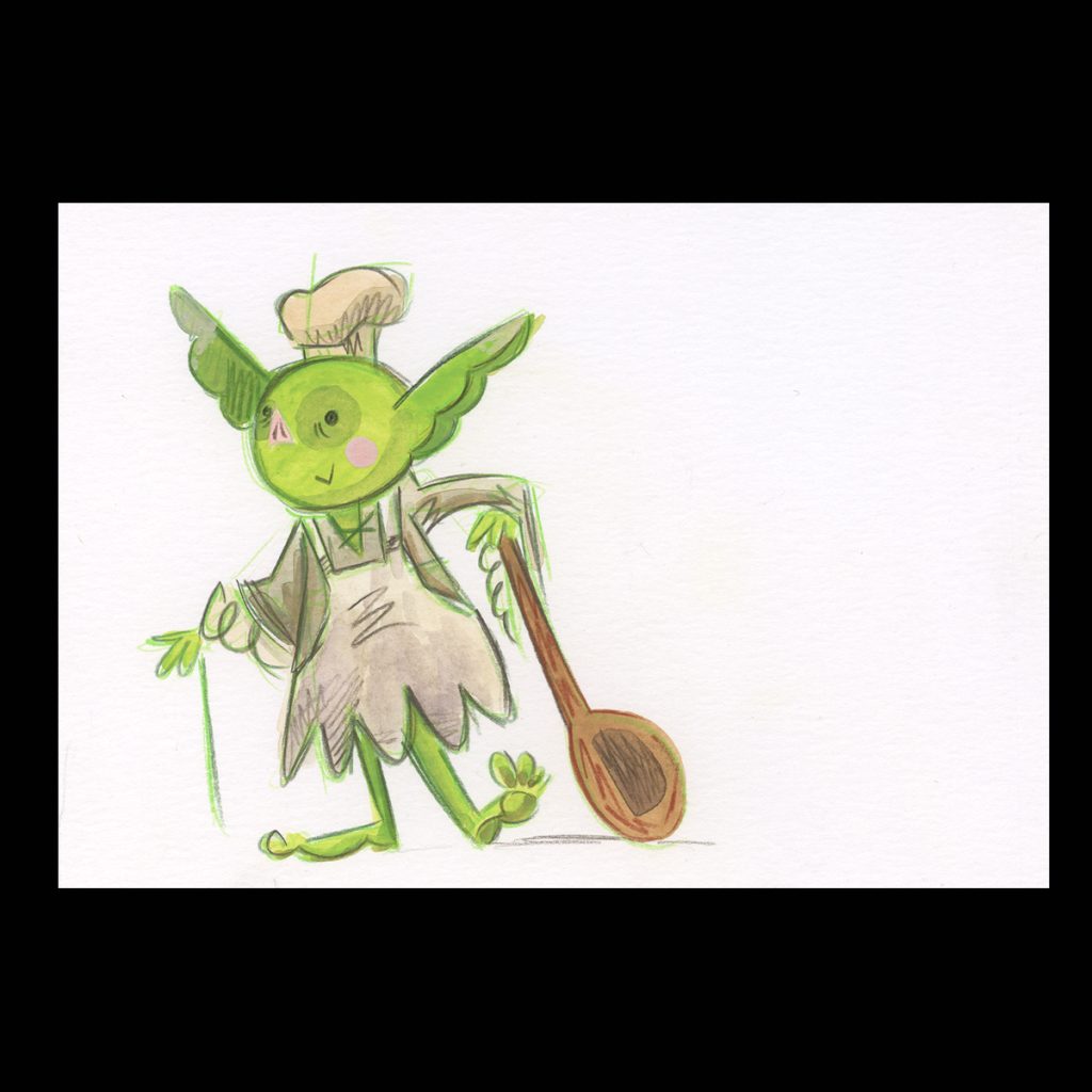
With these methods in mind, I did this kitchen witch illustration. I used colored pencil as a base layer, slowly built the gouache up over the pencil, then color pencils again. I used Strathmore mixed media paper. I like how this one turned out.
Kitchen Witch Above: Layers of Prismacolor color pencil and Winsor & Newton Gouache on Strathmore mixed media paper
I have to admit, though. In the past my art processes have been so straightforward. Ink and color on the computer, or paint and that’s it. These layers of mixed media make me a little nervous. There are so many options and everything interacts with everything else a little different. There is much more to think about and many decisions to be made. It spooks my order seeking brain.
I’m also concerned that I will continue to be able to repeat the same effect over and over, as would be desirable for picture books.
More experimenting.
Then, I bought some Derwent Inktense paints. They don’t reactivate, like Dr. Martin’s, once they are placed on the paper, but they come off a palette and can be reactivated on the palette. This makes them way more accessible then Dr. Martin’s. And I did get a nice bright green out of them. Below are ink and color pencil, and I liked them a lot.
Above: All were done with Derwent Inktense Paint Pan, Prisma color pencil and Derwent Procolor pencil, Dragon was done on Blick watercolor paper, the other two on Strathmore mixed media paper
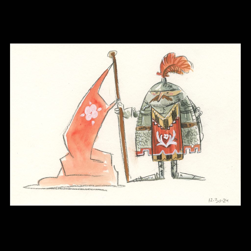
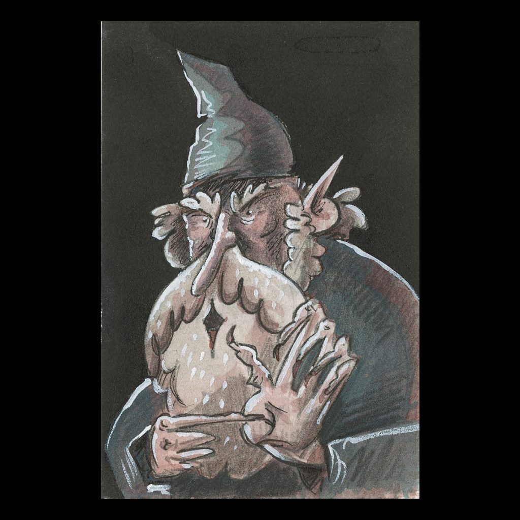
A couple more to note. This knight was done with a simple drawing of pencil, then colored with gouache, then more details over that with pencil. This dark wizard was done in a series of layers of Dr.Martin’s Ink.
Above: Knight done with Prisma color pencil and Winsor Newton gouache on Blick Water color paper. Wizard was done Dr. Martins Bombay ink, Micron pen, white gouache on Stonehenge watercolor hot press paper.
All that to say, I did a fair amount of goofing around before picking a direction for my next project.
In future logs I can go into detail a little more about the how-to’s, but this is to get a quick overview of what I have been goofing around with in a nut shell.
Now, after some experience, I was excited to put my new materials and eagerness to the test and make a book. I have a few books plotted out and different styles in mind for them. First, I am curious to do a style that experiments with the energy of lines. I picked a folk tale and began to plot it out and that is where the next log will begin!
This log (not a blog XD) will be a account of my current projects in illustration. While finishing the comic, Edme, I began thinking about what my next move would be. I have decided to use traditional illustration in my next projects. I want to develop a style and practice methods with a few particular goals in mind: Save the energy of the pencil line, become more familiar with more coloring mediums, get away from technology. I’m also really excited about storytelling and want to keep drawing stories and a variety of characters. The coming logs will follow my journey of illustration and book making, and I’ll share everything I can about the process for those who might be interested in doing it for themselves.
Without further delay, the first log:
Why am I here, learning how to draw again?
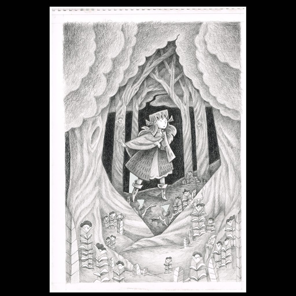
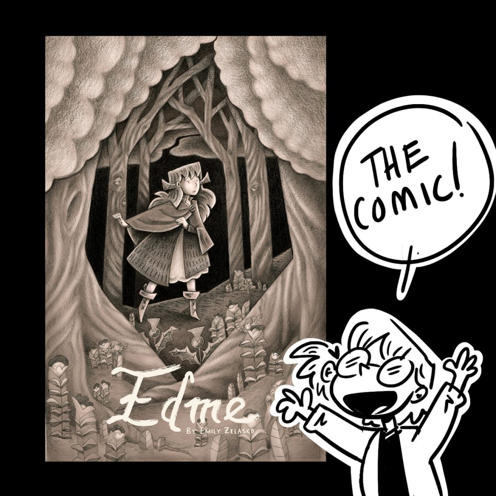
Long story short, working on Edme, my 188 page comic, available now (click here!) XD, taught me a few things. For a while I was really hung up on the style of the comic. I was pulled between what I’m capable of, what I think it should be, and what I want it to be. I was committing myself to a very long process and was putting on myself a lot of pressure for the success of the book. I was going to put a lot of time into this book and because of the sacrifice of time needed, it needed to be done right. I put way too much pressure on myself in regards to the style.
What I‘m capable of
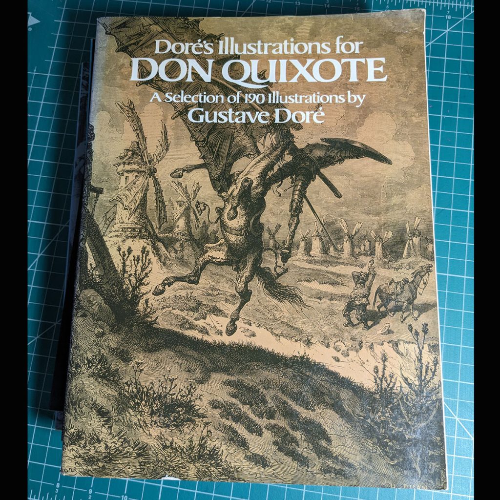
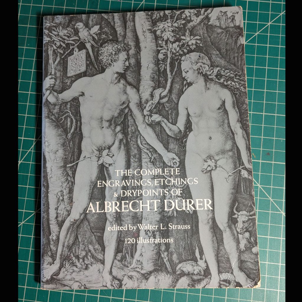
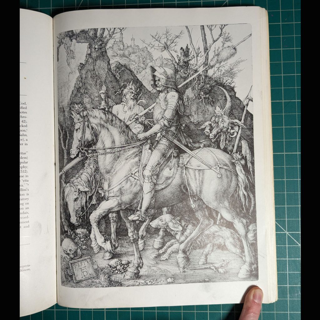
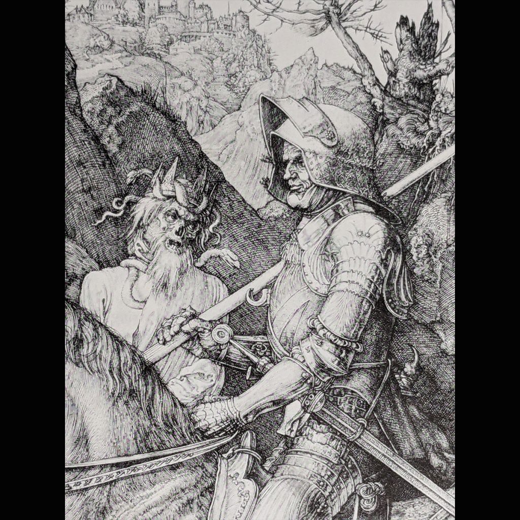
Edme was trouble from the start. I wanted it to be highly detailed. There are comics and art that I admire and I wanted it to be like those. Illustrators such as Gustave Doré and Albrecht Dürer were, and still are, particularly inspirational and motivational to me. Through the process of making the comic I have learned this style of illustration is not for me.
(Samples of Doré and Dürer below.)
-some cool books –
In some of my art you can see me trying and exploring that style (below). For example, this early concept for Edme. They don’t touch the quality of Doré, but you get the idea (maybe (-_-;)).
(The Images above where all ink with pen on paper and (if colored) colored on the computer. The original size of the inking being 11x14in. The first two images are concept art for Edme)
So I had to come up with a plan-B: Foregoing more detailed illustrations for something more simple, modern, and duplicateable. (I enjoy working in this style but not all the time and not for a 188 page comic).
What I think it should be
Unknowingly, I was trying to mimic what I thought an acceptable comic is. It was not natural for me to draw this way nor was it even any fun. It took a while for me to realize that I had unintentionally placed a condition on myself as to how the comic should look. These ideas naturally came from the input of the influences around me: social media, comic shops, other artists, everything. Eventually I learned I’m not interested in drawing these ways either. What a dumb and scary thing to be subconsciously steered by other people’s ideas. (not that anyone was forcing me) Now I know. I did the whole first issue in this way then after it was done and in my hands I realized this is not what I want. And admittedly the drawing was weak. What on earth was I thinking.
What I want it to be
So, then, I was left with the questions of “what do I want the comic to be?” I did not know. Years went by, I did other work and would struggle with my own on and off. But, this is how I found my current direction. Through a series of events, I was learning how really not much in life matters. I was set on things making sense and being a certain way. But, things can be many ways.
As long as the most important thing remains the most important thing (that is another story). But this though also applies to my art.
I had started drawing in my sketch book with pen. I found, the less I cared about the outcome of the sketch, the better it was. I learned to not care. I learned to let the lines be what they will be. Suddenly, I was having fun. I was excited about shapes, and I leaned into it. I thought, if nobody else likes Emde, that is fine. I am going to draw it the way I want to draw it.
-Before--After-
I feel this is a break-through I should have had years ago, but what am I going to do about that? And so I had gone from this to that. The first the comic images are from some years ago and the next three are the final pages from the book.
More important then my drawing style or skill is my new mind set which is projecting these new projects and processes. Not much matter, draw carefree, you have more freedom and options then you know. Since then, and while finishing Edme, I have been thinking about how I want my art to be moving forward. In the next entry, I will reveal my experimentation’s!
I’m making an attempt to record the process of my art and book creating! I’ll be doing blogs here and have videos that go along with the blogs on youtube. It’s a bit of an undertaking for me so wish me luck. (@_@)
Why am I doing this? Because there is a lot of behind the scenes that never get seen and I think that might be interesting and insightful to some people. I’m also at a point where I am experimenting with my next step in art so now might be a good time to record how things go.
I’m sure things are going to start off rough but every week I’ll work to make the videos better and more informative.
The official introduction will come out next Friday February the 22nd! But for now we start off with a short video about inking (n_n)
Also you are all welcome to comment with any question you have involving art, tools, and the process! And I will do my best to answer your questions. Thanks and see you next week!